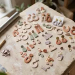
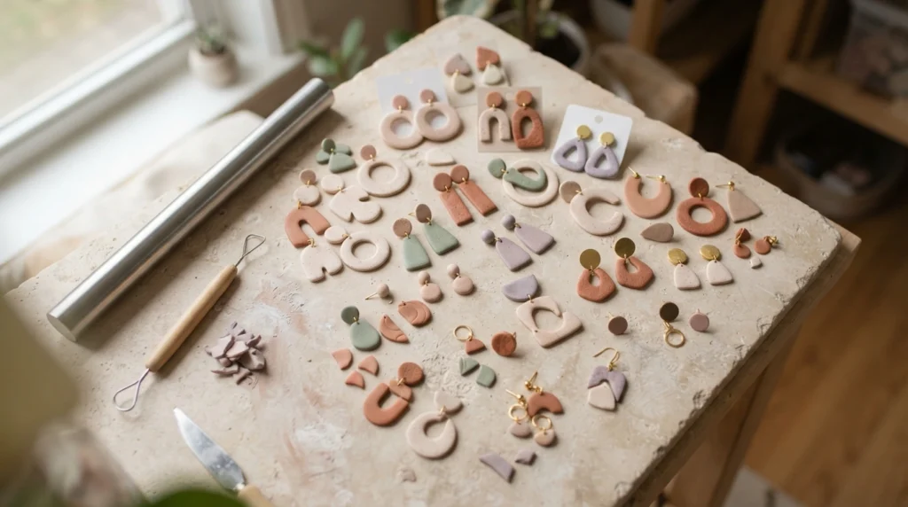
Choosing clay colors can be just as creative as shaping the finished piece. A small change in color can make earrings feel softer, charms look playful, or a tray feel more refined. Mixing your own shades also gives an entire handmade collection a connected appearance, even when every piece has a different design. These 25 polymer clay color mixing ideas focus on easy combinations you can recreate, adjust, and use across jewelry, home decor, charms, and small gifts.
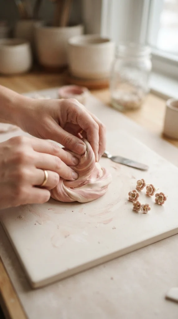
1. Blush Pink and Warm Cream
Blush pink and warm cream create a soft palette that works beautifully for flowers, earrings, beads, and miniature decor. Start with a larger piece of cream clay and add a very small amount of pink. Knead slowly until the color becomes even.
For a softer pastel shade, add more cream. For a stronger dusty rose, add another small piece of pink. Keeping a small test piece beside you makes it easier to repeat the same shade later.
This pairing also works well when you use both colors separately. Try cream bases with blush details, pink petals around cream centers, or alternating beads for a handmade collection that feels connected.
2. Sage Green and Ivory
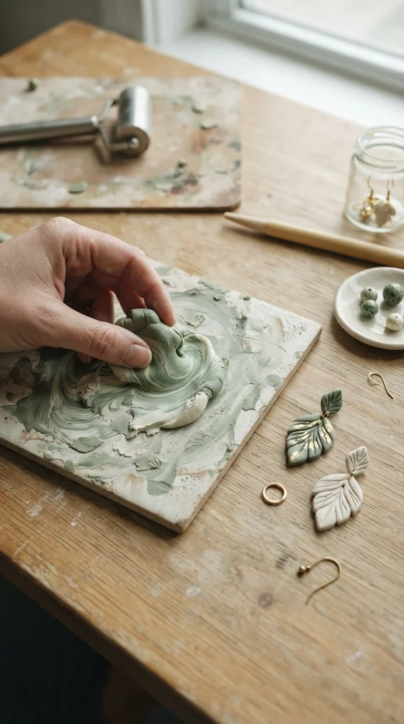
Sage green becomes softer and more natural when paired with ivory. This combination suits botanical designs, plant markers, earrings, beads, small dishes, and nature-inspired charms.
Mix a small amount of sage into ivory rather than starting with equal amounts. This gives you better control over the final shade. A tiny amount of muted green can create a pale garden-inspired color without making the clay look too bright.
Use the two colors together in one piece or create several shades from the same mixture. A light sage base with darker green details can give leaves and flowers more visual depth while keeping the collection calm.
3. Terracotta and Sand
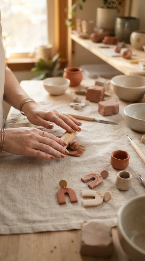
Terracotta and sand are a strong choice for a warm handmade palette. They bring a sun-baked, earthy feeling to arches, geometric earrings, wall charms, beads, and miniature pottery designs.
Start with sand-colored clay and gradually add terracotta until you reach the shade you want. A little terracotta can create a muted peach-beige, while a larger amount gives you a richer clay-like tone.
Try making three related shades from one base mixture. Use the palest color for the main shape, medium terracotta for details, and deeper terracotta for small accents. This creates a coordinated set without making every piece identical.
4. Dusty Blue and Soft White
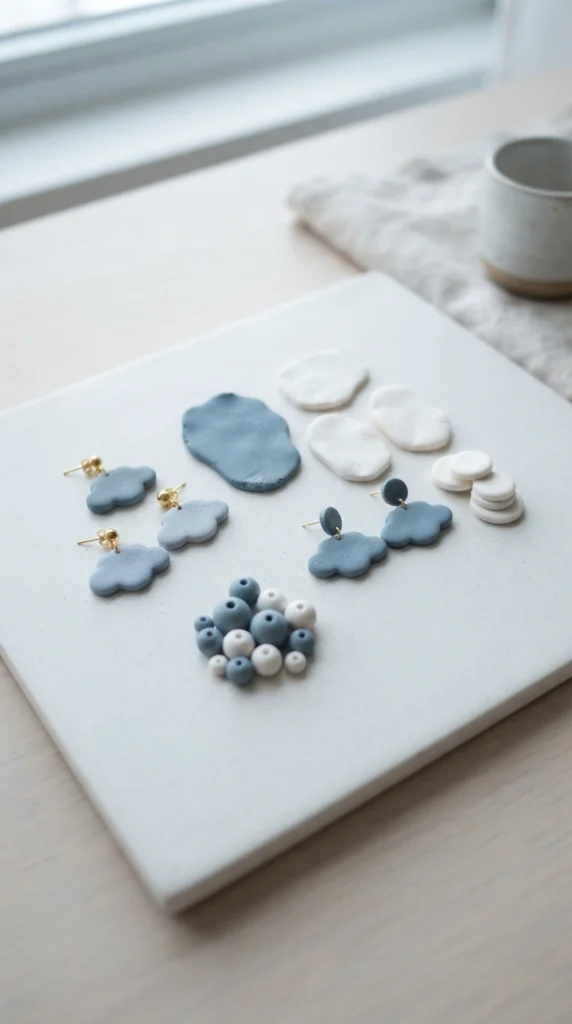
Dusty blue becomes especially gentle when mixed with soft white. The result works for celestial charms, abstract earrings, tiny flowers, clouds, stars, and simple geometric jewelry.
Take a small portion of white clay and add blue little by little. Knead the clay completely before deciding whether you want more pigment. This prevents you from making the color darker than intended.
For a cohesive collection, make one pale blue and one slightly deeper version. You can use the lighter shade for larger surfaces and the deeper shade for small dots, stripes, petals, or tiny hanging charms.
5. Lavender and Cream
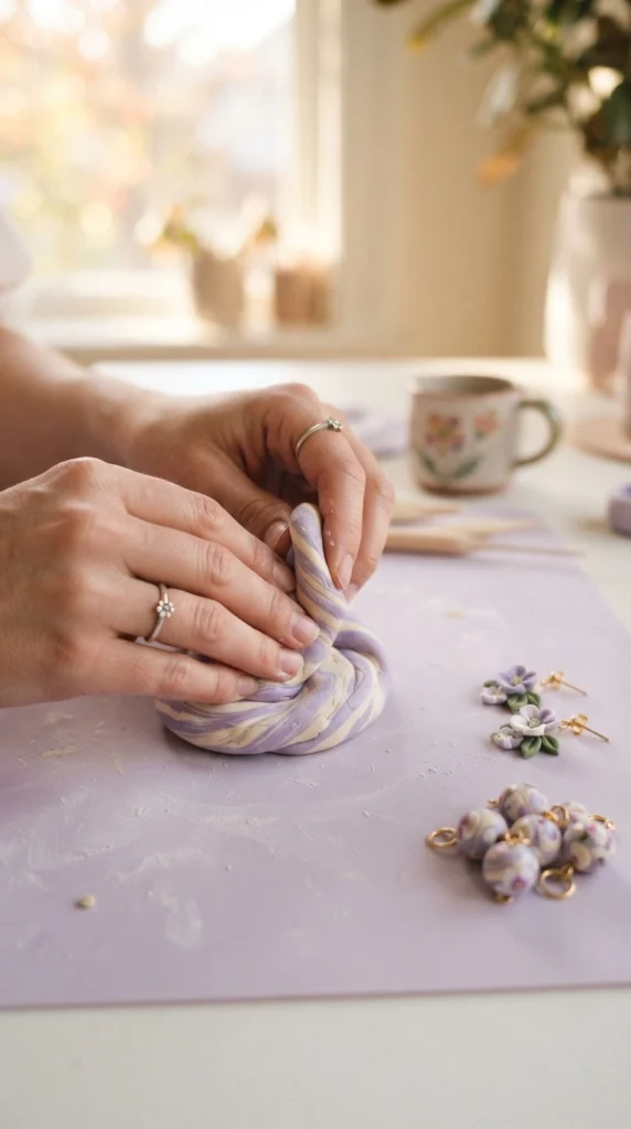
Lavender and cream create a gentle palette that works especially well for floral jewelry and small decorative pieces. The cream softens the purple while keeping enough color for the finished piece to stand out.
Add tiny portions of lavender into cream and knead between additions. If you want a muted lilac, keep the lavender amount low. A slightly stronger purple works nicely for flower centers or small accent shapes.
You can build a whole collection from this pairing. Try cream flower petals with lavender centers, lavender beads with cream spacers, or alternating colors across a pair of earrings.
6. Mustard Yellow and Beige
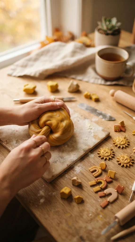
Mustard yellow can become much easier to use when softened with beige. Instead of a strong yellow, you get a warm ochre-like shade that pairs beautifully with brown, cream, rust, and muted green.
Begin with beige and add a small amount of mustard. Mix thoroughly before adding more. This lets you create pale golden shades as well as deeper mustard tones from the same starting colors.
Use several related shades in one design for a handmade appearance. A beige base with mustard flowers or a golden arch with darker clay dots can create visual interest without adding too many unrelated colors.
7. Peach and White
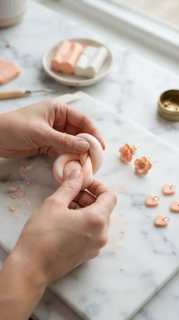
Peach and white are easy to work with when you want a cheerful but soft palette. The combination suits flowers, hearts, fruit charms, beads, hair clips, and simple statement earrings.
Start with white clay and add a small amount of peach. Because pastel shades can change quickly, use small additions and knead completely between each one.
A pale peach works well as a main color, while stronger peach can be saved for tiny details. Pairing these shades with cream or light brown can also give the finished collection a warmer appearance.
8. Cocoa Brown and Cream
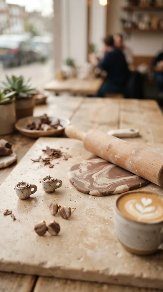
Cocoa brown and cream create a warm neutral palette that works across jewelry and miniature clay designs. The pairing is especially fitting for coffee charms, cookies, leaves, bows, beads, and geometric pieces.
Mix a little cocoa clay into cream to create a light latte shade. Add more brown for a deeper coffee tone. Keep small samples of each mixture so you can compare them before using the clay in a larger project.
These colors also make a useful base for other palettes. A little terracotta, dusty pink, or muted green can be added to the collection while the cocoa and cream keep everything visually grounded.
9. Olive Green and Tan
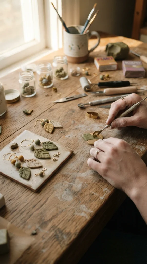
Olive green and tan bring a natural feel to polymer clay projects without relying on bright colors. They work well for leaves, mushrooms, garden charms, earthy earrings, and miniature outdoor scenes.
Start with tan clay and add olive in tiny amounts. A small amount produces a soft khaki shade, while more olive creates a stronger botanical green.
Try making three shades and using them in layers. A pale tan base, muted olive details, and deeper green accents can make a simple leaf or floral piece feel more dimensional while keeping the palette connected.
10. Rose Pink and Chocolate Brown
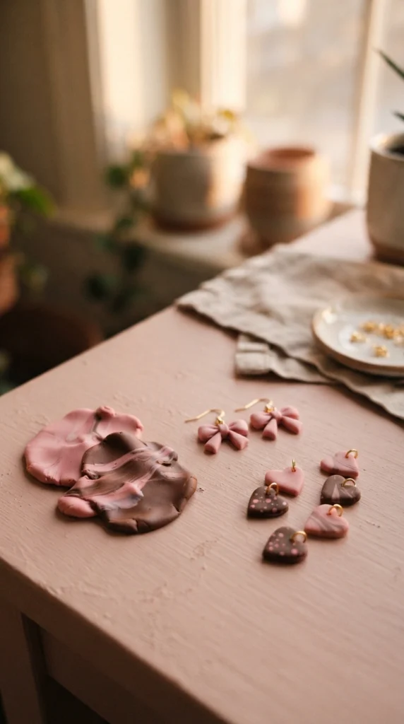
Rose pink becomes richer when paired with chocolate brown. The darker neutral gives pink designs more contrast and works especially well for bows, hearts, flowers, checker patterns, and small jewelry sets.
Use pink as the main color and brown for small details, or mix a little brown into pink for a muted rose-brown shade. Add the darker clay slowly because it can change the final color quickly.
This palette can also work across seasonal collections. Use lighter pink in spring-inspired designs and deeper rose with chocolate accents for autumn or winter pieces.
11. Powder Blue and Pale Gray
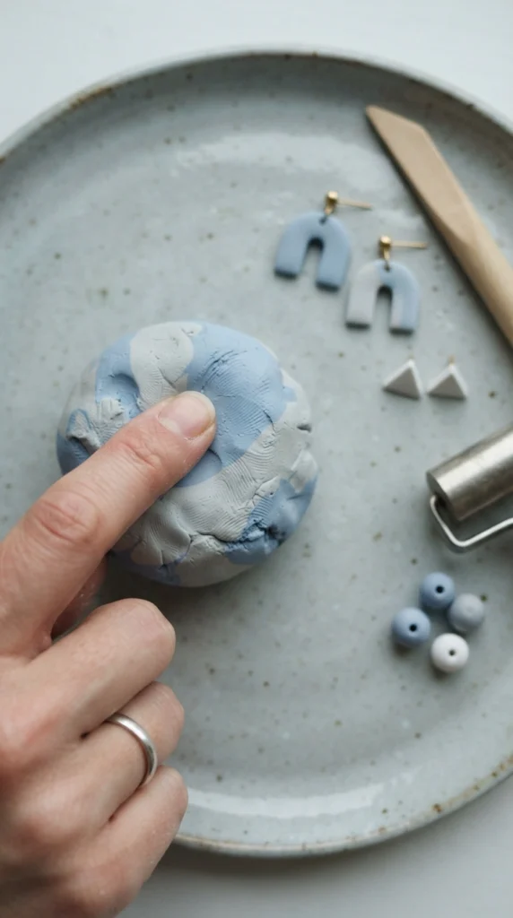
Powder blue and pale gray create a muted palette with a clean, modern feeling. It works particularly well for simple arches, circles, rectangles, moons, stars, and understated jewelry.
Begin with pale gray and add blue gradually. You can make a barely blue gray or move toward a more visible powder blue depending on the amount of color added.
For a cohesive set, keep the shapes simple and repeat the same two or three shades. Small gray spacers between blue beads or gray details on blue earrings can tie separate designs together.
12. Rust Orange and Cream
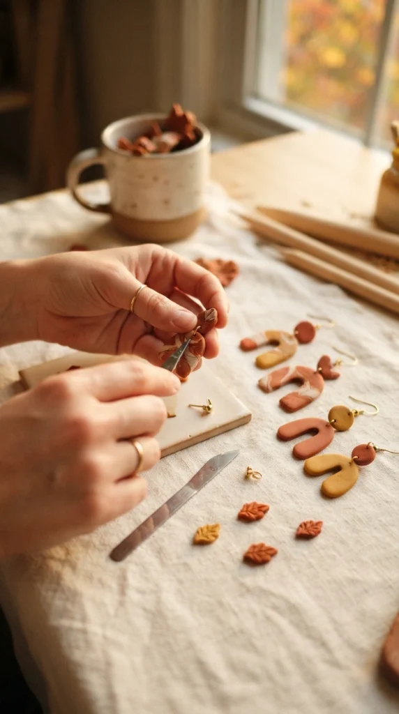
Rust orange paired with cream gives polymer clay projects a warm handmade character. It is a strong choice for leaves, arches, pumpkins, abstract earrings, flowers, and seasonal charms.
Use cream as the starting color when creating a softer rust shade. Add small portions of orange and mix thoroughly until the color settles into a muted tone.
You can also keep rust and cream separate rather than mixing them completely. Cream shapes with rust accents often have more contrast, while a mixed rust-cream shade works well for larger surfaces.
13. Mint Green and White
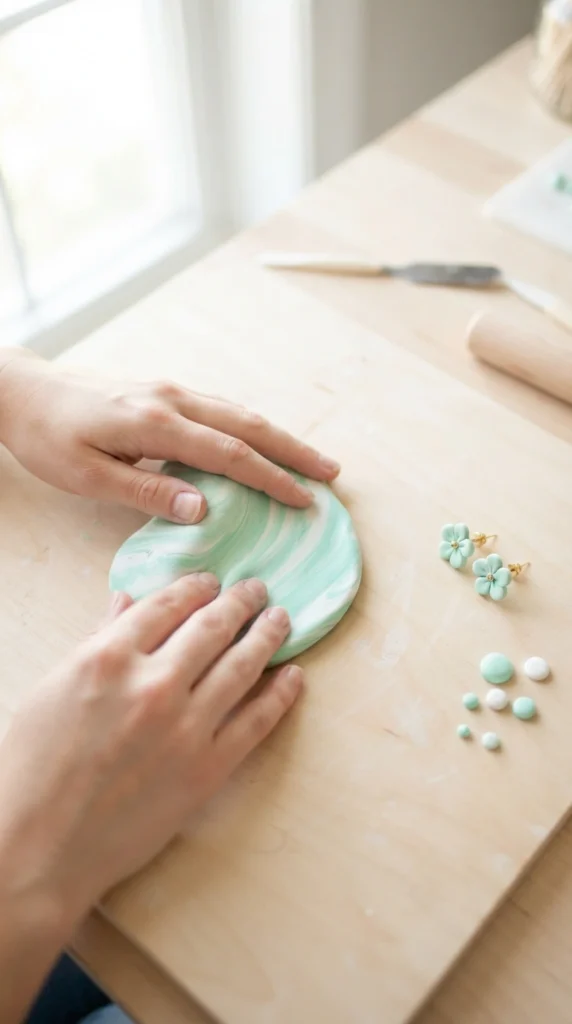
Mint green and white create an easy pastel palette for playful jewelry and small craft projects. The colors work nicely for flowers, fruit, leaves, hearts, beads, and miniature food designs.
Add mint to white in very small amounts. A little color gives you a pale pastel green, while more mint creates a stronger shade for details and decorative elements.
Try making one very pale mint and one medium mint from the same base. The lighter version can cover larger areas, while the darker one adds definition around petals, leaves, or geometric patterns.
14. Burgundy and Blush
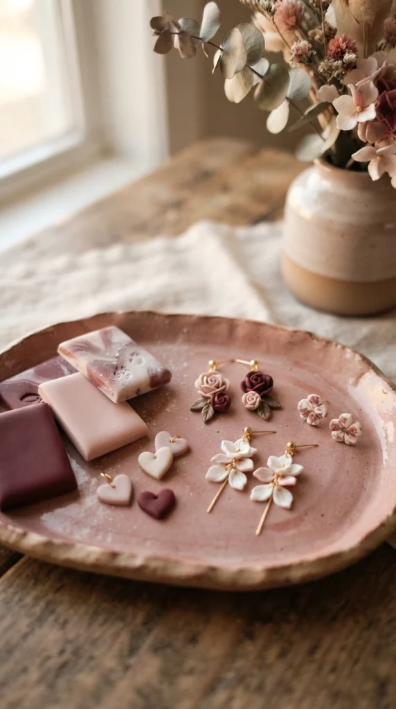
Burgundy and blush offer a rich color pairing without making a handmade piece feel overly bright. The contrast works especially well for flowers, bows, hearts, statement earrings, and decorative beads.
Use blush as your lighter base and add a tiny amount of burgundy to create a dusty berry shade. Burgundy is strong, so small additions can make a clear difference.
For jewelry, keep burgundy in smaller areas and let blush occupy more space. This creates a balanced design while giving the darker shade a clear visual role.
15. Cream, Camel, and Soft Brown
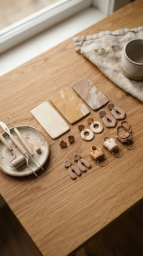
A group of warm neutrals can make an entire polymer clay collection feel connected. Cream, camel, and soft brown are useful for arches, bows, checker designs, beads, tiny bags, coffee charms, and abstract earrings.
Rather than mixing all three colors together, create separate shades and use them beside one another. This keeps each color clear while giving the finished piece a coordinated appearance.
You can also make a lighter camel by adding cream to brown. Save the darkest brown for tiny details such as outlines, centers, dots, or miniature handles.
16. Dusty Rose and Mauve
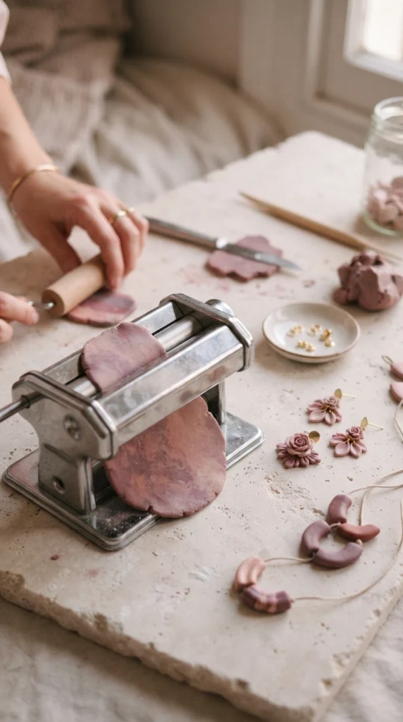
Dusty rose and mauve are closely related shades that work beautifully for layered designs. They are useful for flowers, petals, bows, scalloped earrings, beads, and abstract clay pieces.
Start with dusty rose and add a small amount of purple-toned mauve to create a deeper variation. You can keep the original pink as the lightest color and use the darker mixture for details.
This approach is helpful when making matching jewelry. One shade can appear on the main earring shape while the other appears on a small flower, bead, or charm.
17. Sky Blue and Beige
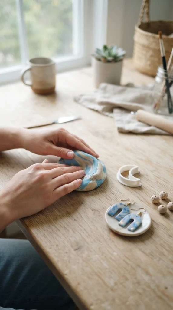
Sky blue can feel softer and more grounded when paired with beige. This combination works for clouds, arches, waves, flowers, simple jewelry, and playful charms.
Add blue slowly to beige if you want a muted blue-gray shade. For a clearer sky blue, keep the beige amount smaller and use it as a separate accent instead of mixing too much into the blue.
A useful trick is to create two shades from the same palette: a pale blue for larger pieces and a slightly muted blue for smaller accents. Beige can then act as the neutral color that ties the designs together.
18. Coral and Sand
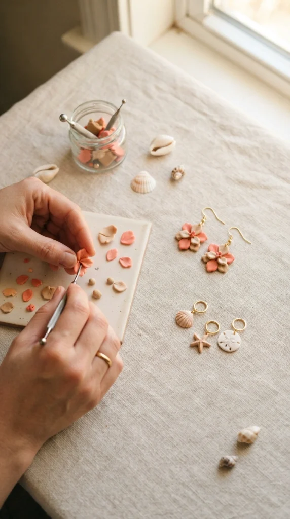
Coral and sand bring a warm, sunny feeling to polymer clay projects. They are especially suitable for flowers, shells, sun charms, arches, fruit-inspired pieces, and summer jewelry.
Start with sand-colored clay and add coral in small portions. This produces a softened coral that works well for larger shapes without looking too intense.
For a coordinated collection, use coral as the main color and sand as a neutral partner. A few cream or brown details can be added without taking the focus away from the warm coral tones.
19. Forest Green and Cream
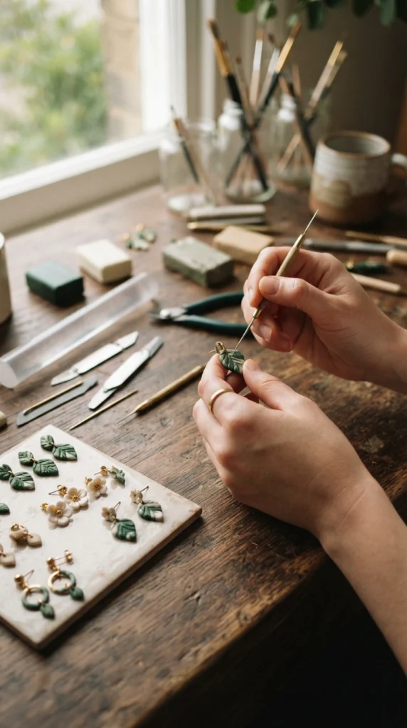
Forest green and cream create strong contrast while keeping the palette simple. The combination works well for botanical jewelry, mushrooms, leaves, wreath charms, geometric earrings, and seasonal pieces.
If the green is very dark, use cream as the larger portion when creating a lighter green variation. This gives you several related shades without adding another color.
For a cohesive collection, keep the darkest green for small details. Cream bases with forest green leaves or green arches with tiny cream dots can create a balanced handmade design.
20. Lemon Yellow and Soft Gray
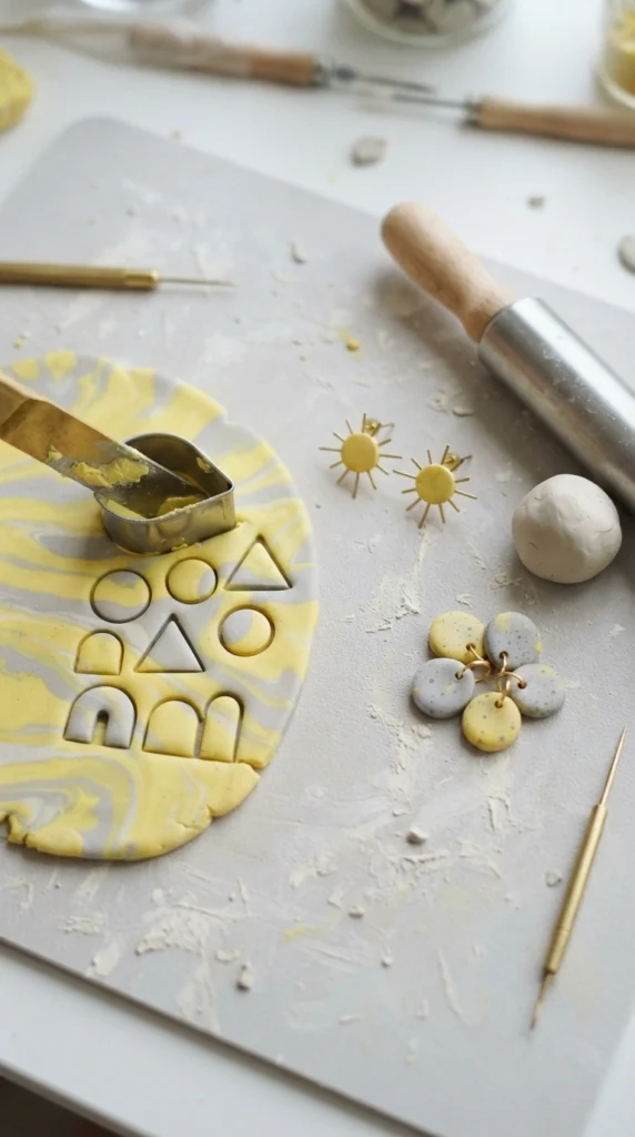
Lemon yellow becomes easier to style when paired with a quiet soft gray. The contrast works well for suns, flowers, abstract shapes, smiley charms, beads, and playful earrings.
Mix a small amount of yellow into gray when you want a muted mustard-gray shade. For a clearer yellow, keep the colors separate and let gray act as the neutral background or accent.
This palette is especially useful when you want a handmade piece that feels cheerful without using several bright colors. Repeating the same yellow and gray across multiple designs can make a small collection feel intentionally coordinated.
21. Plum and Cream
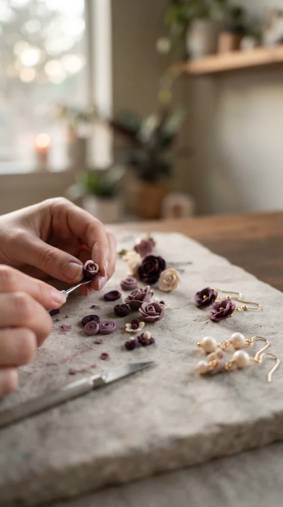
Plum and cream create a deeper color pairing that works beautifully for floral designs and statement jewelry. Cream helps soften the darker purple while keeping the finished piece visually balanced.
Add small portions of plum into cream to make a muted mauve-plum shade. Keep some pure plum aside for details such as flower centers, borders, beads, or tiny decorative shapes.
For a matching set, use cream as the base on one piece and plum as the base on another. Repeating the same two colors across different shapes can make the designs feel like part of one collection.
22. Warm Gray and Terracotta
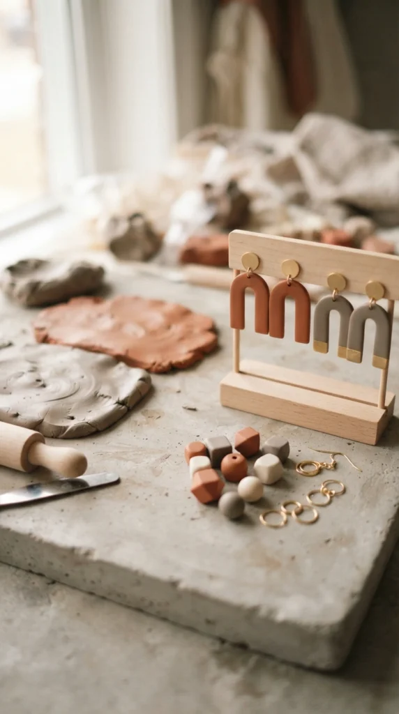
Warm gray and terracotta create an earthy modern pairing. The combination suits abstract earrings, geometric pendants, arches, beads, and small home decor pieces.
Mix a little terracotta into warm gray to create a muted clay-colored gray. Add more terracotta if you want the final shade to lean warmer.
You can also keep the two colors separate for stronger contrast. A warm gray arch with terracotta dots, stripes, or small flowers gives you a simple design with enough variation to catch the eye.
23. Seafoam and Beige
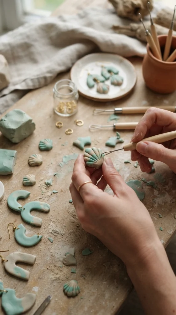
Seafoam and beige work well when you want a soft coastal-inspired color palette. These shades suit shells, waves, flowers, scallops, beads, arches, and simple summer jewelry.
Begin with beige and add a little seafoam to create a muted green-beige. For a clearer seafoam shade, use white or cream as the starting point and add green-blue clay gradually.
Try keeping the two colors in different parts of the same design. Beige can form the main arch or shell while seafoam adds small waves, dots, petals, or curved lines.
24. Cinnamon and Pale Pink
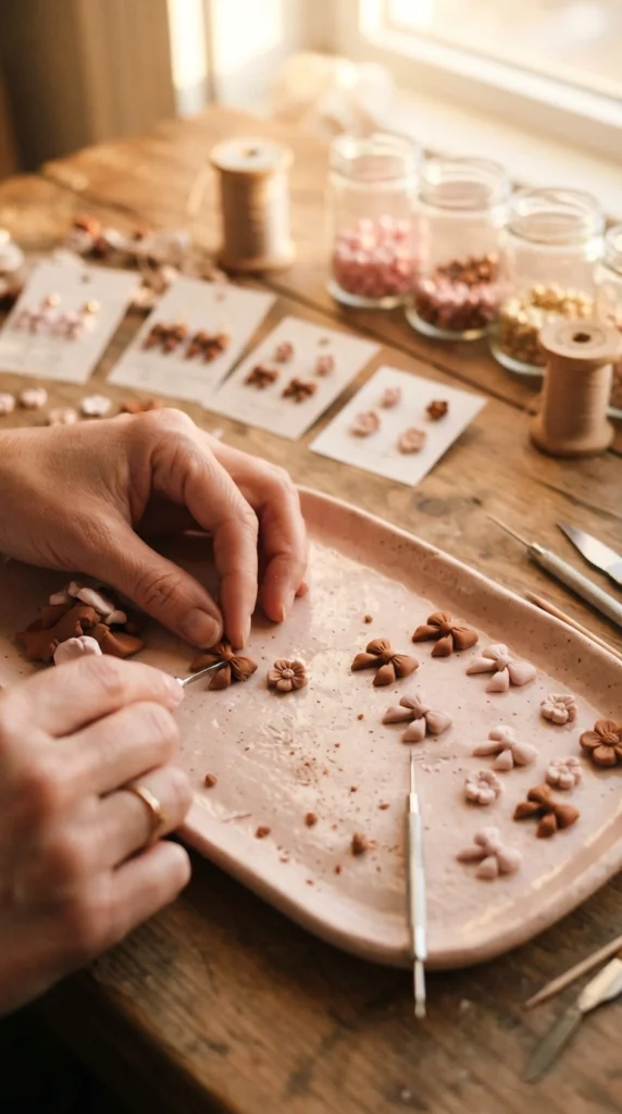
Cinnamon brown gives pale pink a warmer, grounded partner. The combination works nicely for bows, flowers, hearts, checker designs, beads, and cute miniature accessories.
Add a tiny amount of cinnamon clay to pale pink if you want a muted rose-brown shade. Keep some pure pink and cinnamon aside so you can use all three tones in one project.
For earrings, try a pale pink main shape with cinnamon details. A small brown bow on a pink base or cinnamon beads paired with pink charms can create a coordinated look without adding extra colors.
25. Build a Three-Color Signature Palette
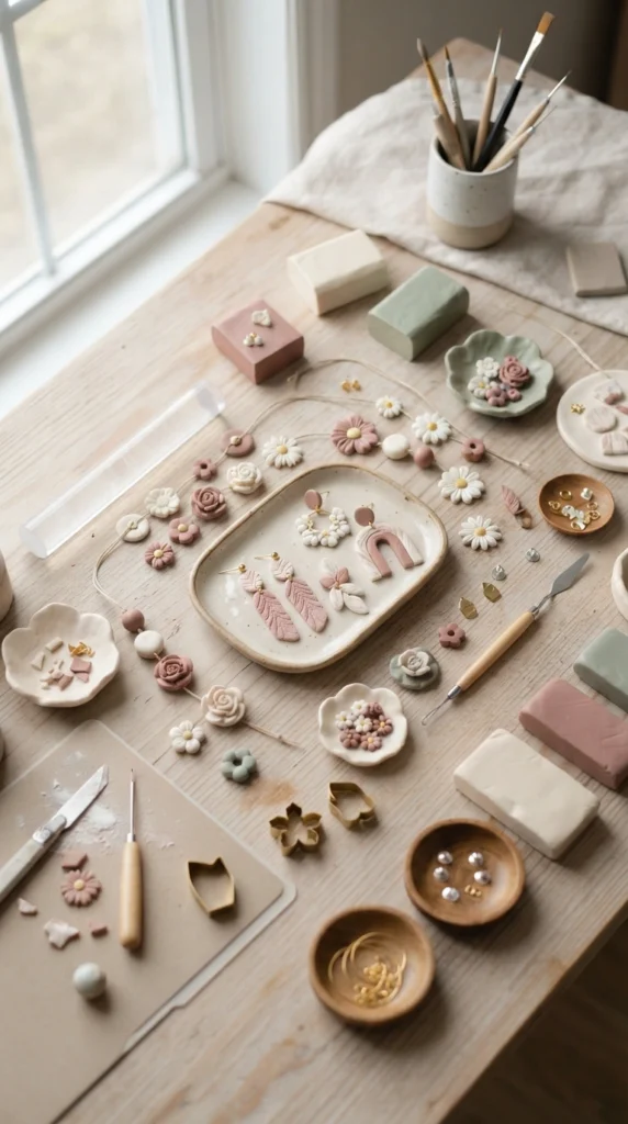
One of the easiest ways to create a cohesive handmade collection is to choose three colors and repeat them across different projects. A combination such as cream, dusty rose, and sage can work for earrings, charms, beads, trays, magnets, and decorative pieces.
Choose one light neutral, one main color, and one darker or earthy accent. Mix small test portions before committing to a larger batch, then keep your favorite samples nearby as a color reference.
You do not have to use all three colors in every piece. One project might be mostly cream with tiny sage details, while another could feature dusty rose as the main color. Repeating the same palette across different shapes is enough to make the collection feel connected.
Final Thoughts
A cohesive polymer clay collection does not require dozens of unrelated colors. Start with a small palette, mix gradually, save test pieces, and repeat your favorite shades across different designs. The combinations above give you plenty of ways to create soft pastels, earthy neutrals, rich accents, and balanced three-color collections. Pick one palette today and make three small clay samples before starting your next finished piece.

Lily Summers is a digital artist and creative storyteller who loves bringing colorful characters to life. With a passion for cartoons, fan art, and playful sketches, she inspires others to explore their imagination through art. When she’s not sketching, you’ll find her dreaming up new ideas for CraftedWizard.com to spark creativity in every artist. 🌈✨