My living room felt flat for years. I had good furniture but wrong colors and no layering. I spent about $420 on textiles and lighting. The space now reads calm and deliberate. Guests ask how I did it. The trick was choosing a restrained palette and adding depth with texture and a single luxe color.
Quick context
This guide targets modern classic living rooms with a hint of contemporary warmth. Budget here is $300–$700 if you’re refreshing an existing room. These tips work for medium to large living rooms. Trend note: designers in 2026 favor warm neutrals with one deep accent color.
What You'll Need for This Look
Foundation pieces:
- 8×10 jute area rug in natural (~$120–180) — 1 rug
- Linen curtains in white, 96-inch length (~$35–50 per panel; 2–4 panels)
Textiles & layers:
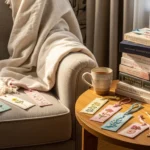
- Chunky cable knit throw in oatmeal, 50×60 inches (~$40–60) — 1 throw
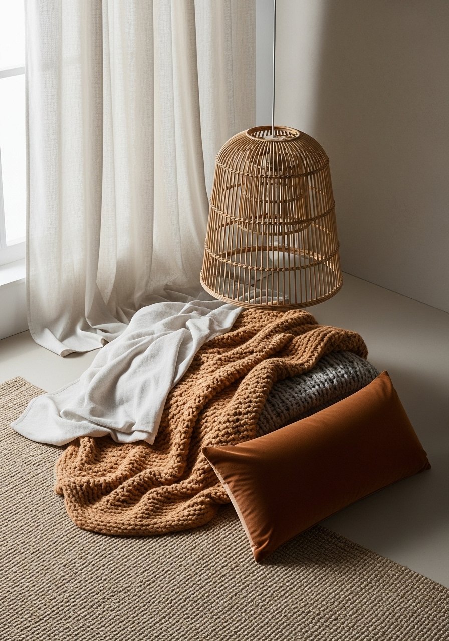
- Velvet lumbar pillow cover in emerald, 12×20 inches (~$18–30) — 1 cover
- Euro pillow inserts 26×26 set of 2 (~$35–50) — 2 inserts
- Decorative pillow covers 20×20 neutral set of 3 (~$25–40)
Lighting:
- Rattan pendant light 15-inch diameter (~$60–90) — 1 fixture
- Table lamp with linen shade, 26 inches tall (~$45–70) — 1–2 lamps
- Dimmable warm LED bulbs 2700K, 4-pack (~$15–25)
Plants & accessories:
- Artificial fiddle leaf fig tree, 6 ft, in cement pot (~$90–140) — 1
- Woven storage baskets set of 3, natural seagrass (~$35–55)
- White oak floating shelves, set of 2, 24-inch (~$60–90)
Budget-friendly swap:
- Linen-blend curtains, white, 96-inch (~$18–28 per panel)
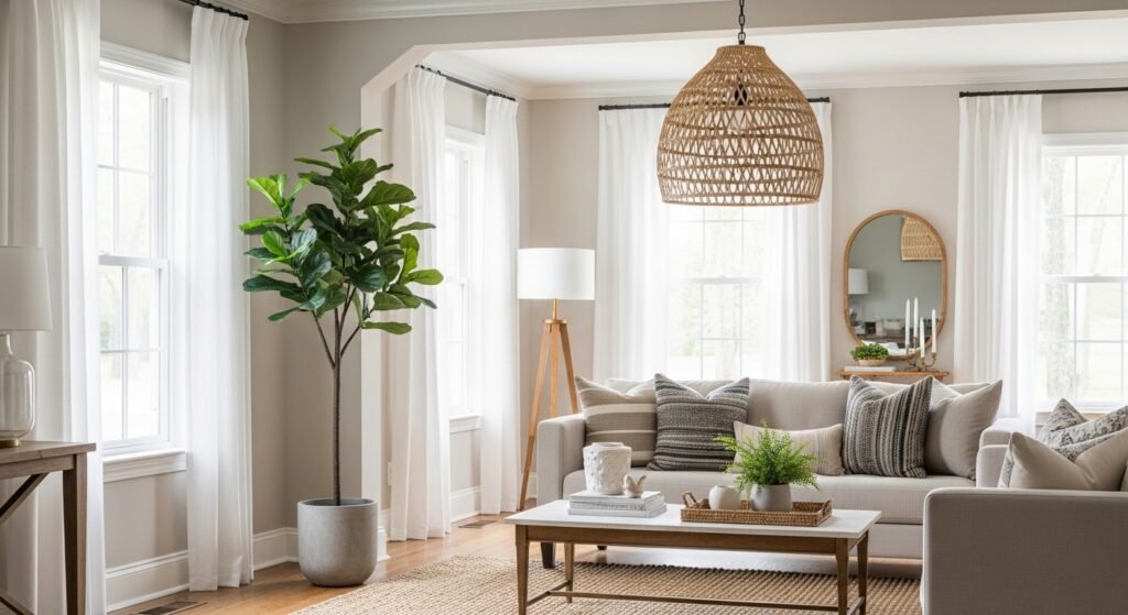
Start with the foundation: Rug and curtains
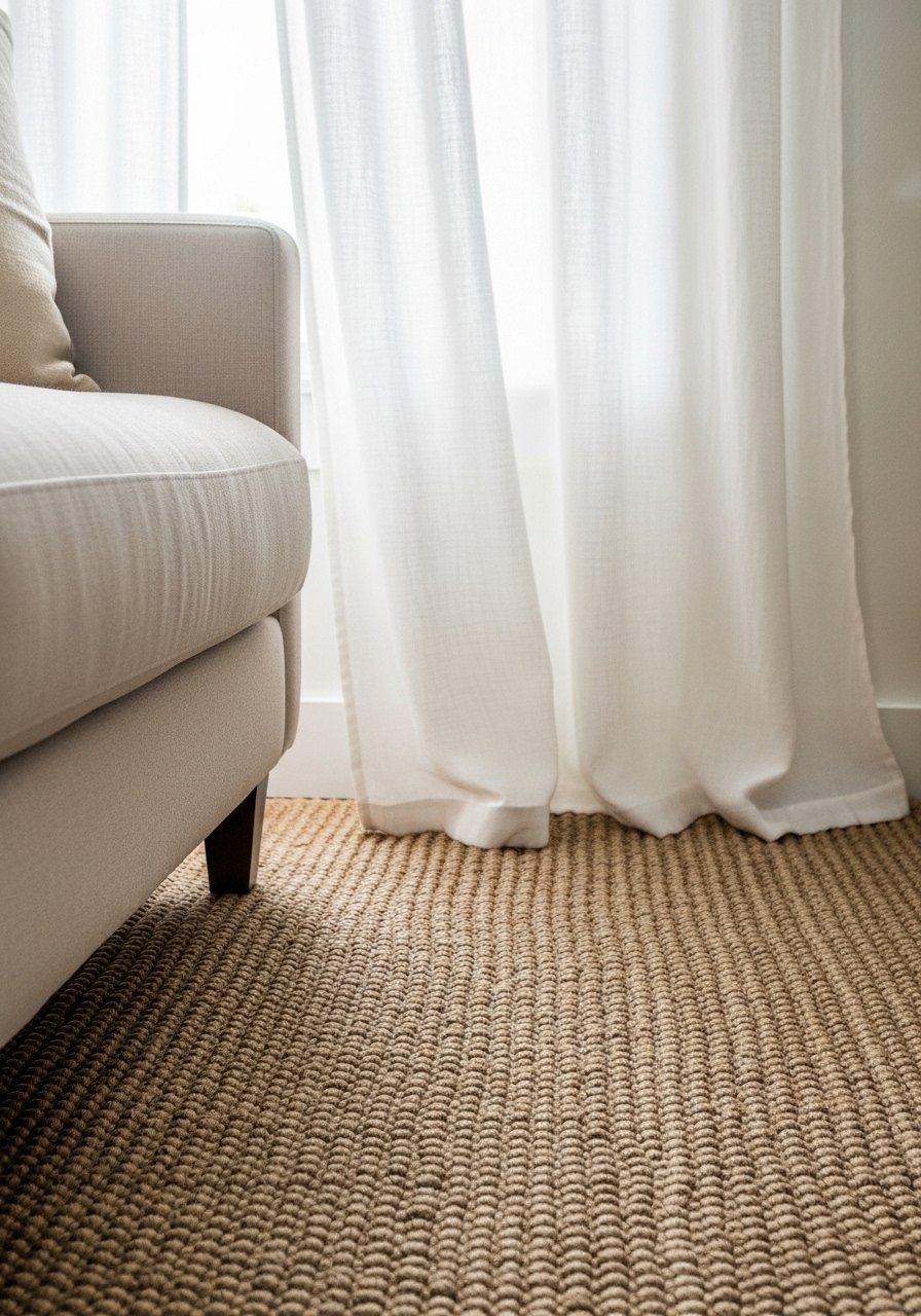
The rug and curtains set the room’s scale and base color. I chose the 8×10 jute rug for its warm straw tone. Place it so the front legs of the sofa and chairs sit on it. If the rug is too small the arrangement looks disjointed. For curtains, hang white linen panels as close to the ceiling as possible. Mount the rod 2–4 inches below the ceiling line. Panels should just kiss the floor. That extra height reads like intentional proportion and lifts the room.
Visual principle: large, low grounding element (rug) with vertical lift (curtains). Balance warm natural texture with clean white linen to keep the palette refined. Common mistake here is choosing a patterned rug too soon. I avoided pattern and added interest later with textiles.
Layer in softness with oversized textiles for depth
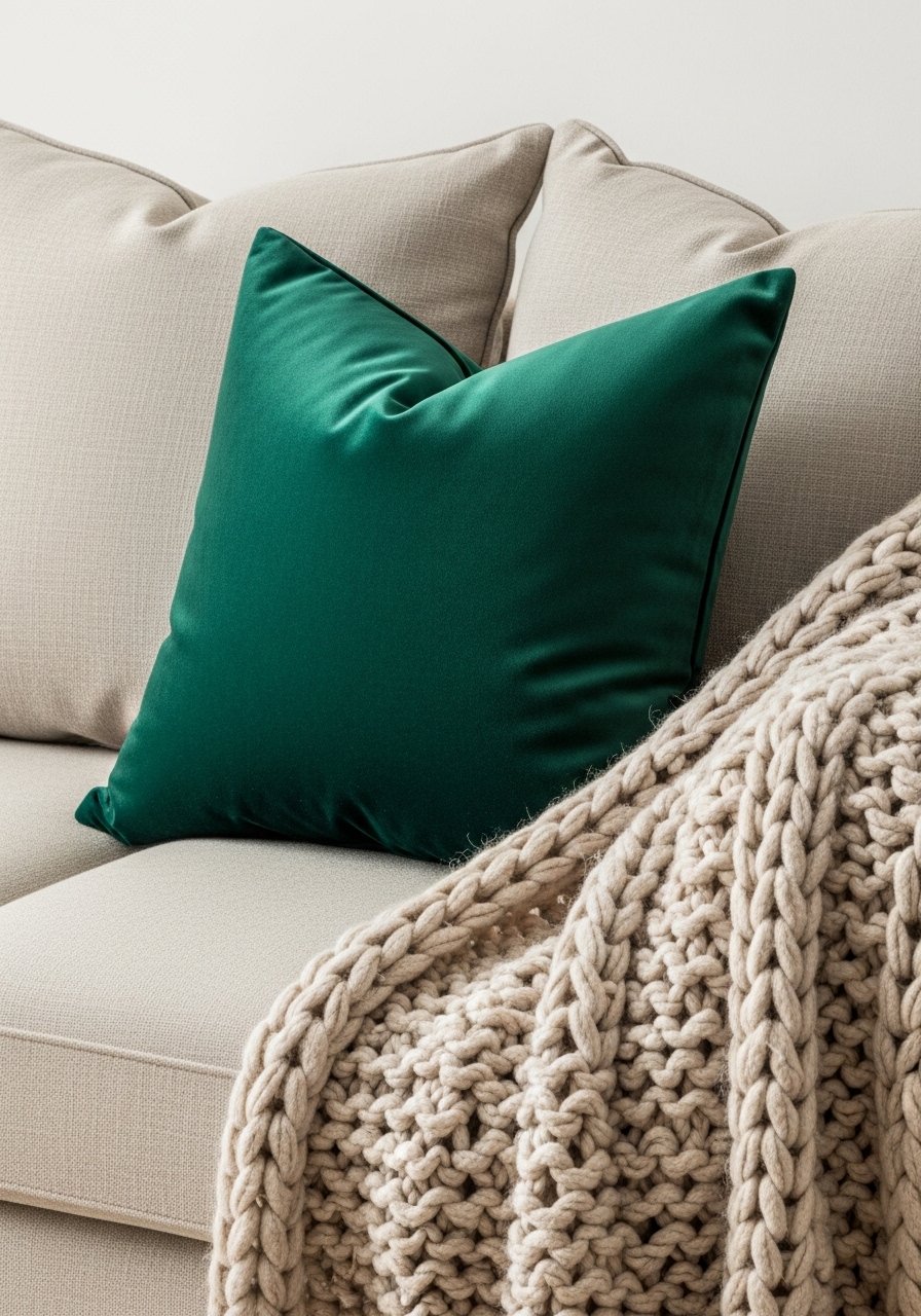
Soft layers create luxury without fuss. I used euro pillow inserts 26×26 behind two neutral 20×20 pillow covers. In front I added a velvet lumbar pillow in emerald 12×20 for a single luxe color. The rule I follow: pillows equal about one third the width of the seat depth and use odd numbers—3 or 5 per side. Drape the chunky cable knit throw over one arm and fold one corner across the seat. That layered approach gives depth and keeps the palette calm.
What didn’t work: I initially filled the sofa entirely with velvet. It read heavy. Adding linen-look covers warmed the set and added contrast. Texture contrast is what makes a restrained palette read expensive.
Create ambiance with warm, diffused lighting
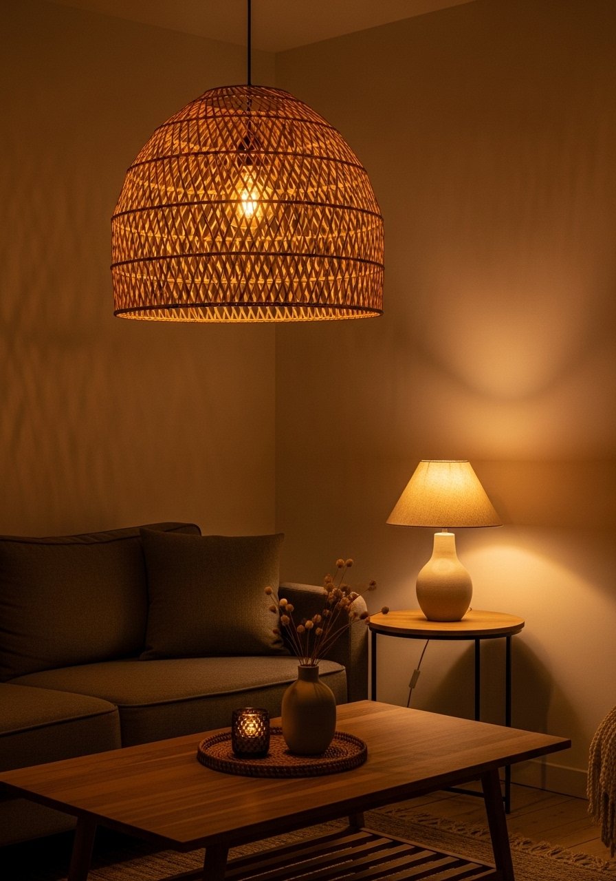
Lighting makes color feel intentional. I installed a rattan pendant 15-inch centered over the coffee table. Then I added a table lamp with a linen shade, 26 inches tall on a side table and a floor lamp for reading. Use dimmable warm LED bulbs 2700K. The layered sources create pools of light and stop the ceiling from becoming the focal point.
Placement rule: overhead for general light, table lamps for eye-level glow, and floor lamp for task zones. Avoid a single bright overhead fixture. I learned that the hard way—my first setup felt like a showroom. Dimming and mixing sources made the palette true to life.
Common Styling Mistakes to Avoid
Mistake: buying a rug too small
Why it doesn't work: Furniture floats and the room reads chopped.
Do this instead: get at least an 8×10 for standard living rooms so front legs sit on the rug. See 8×10 jute rug.
Mistake: all decor at the same height
Why it doesn't work: The eye has nowhere to travel.
Do this instead: vary heights in odd numbers. Graduated candlesticks set adds instant variation.
Mistake: using only one texture type (all velvet or all linen)
Why it doesn't work: The palette feels flat.
Do this instead: mix a natural fiber like jute with a soft velvet lumbar and a knit throw. Try chunky knit throw and velvet lumbar.
Shopping Guide: Where to Find These Items
- For budget curtains on Amazon: look at linen-blend curtains 96-inch white. They look like real linen at half the price.
- Splurge on the rug: a quality jute or hand-woven rug lasts years. Example: hand-woven jute rug 8×10.
- Realistic faux plants beat struggling real ones: I use a 6 ft artificial fiddle leaf fig in cement pot.
- Choose warm white bulbs: dimmable 2700K LED bulbs 4-pack keep color accurate.
- For open shelving: white oak floating shelves 24-inch are a trendy wood tone that pairs with warm neutrals.
Start with the rug and curtains. Those two changes alone will change how you see the room. I added a chunky throw later and it made the space feel refreshed again. Which piece will you choose first?