Mixing colors in a bedroom can feel exciting right up until it starts feeling confusing. One minute you are saving dreamy inspiration photos, and the next you are wondering if sage goes with blush, whether navy is too dark, or why your favorite colors suddenly look messy together. The good news is that a stylish bedroom does not need a complicated palette. It just needs a little balance.
When colors are mixed well, a bedroom feels layered, personal, and polished. It looks intentional instead of random, cozy instead of crowded, and stylish without trying too hard. Once you know a few simple rules, mixing colors gets much easier.
Start With One Main Color
The easiest way to mix colors without making a bedroom feel chaotic is to begin with one clear main color. This becomes the anchor for the whole room and gives everything else direction.
Your main color might show up in:
- The wall color
- The bedding
- A large rug
- Curtains
- A headboard
This dominant shade sets the mood. For example:
- Soft blue feels calm and airy
- Sage green feels natural and fresh
- Warm beige feels cozy and timeless
- Dusty blush feels soft and romantic
- Charcoal or navy feels moody and elegant
Once you choose the main color, it becomes much easier to decide what works with it and what does not.
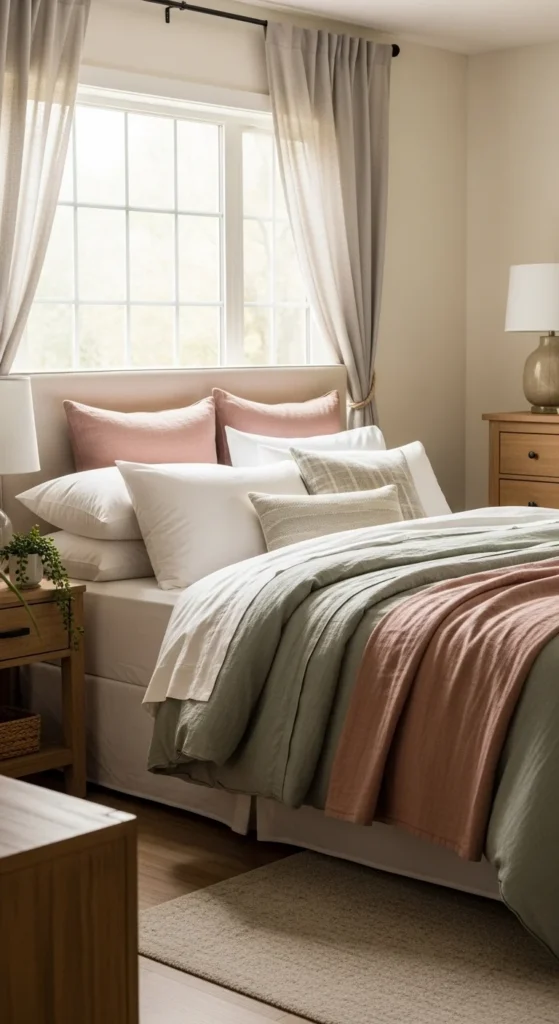
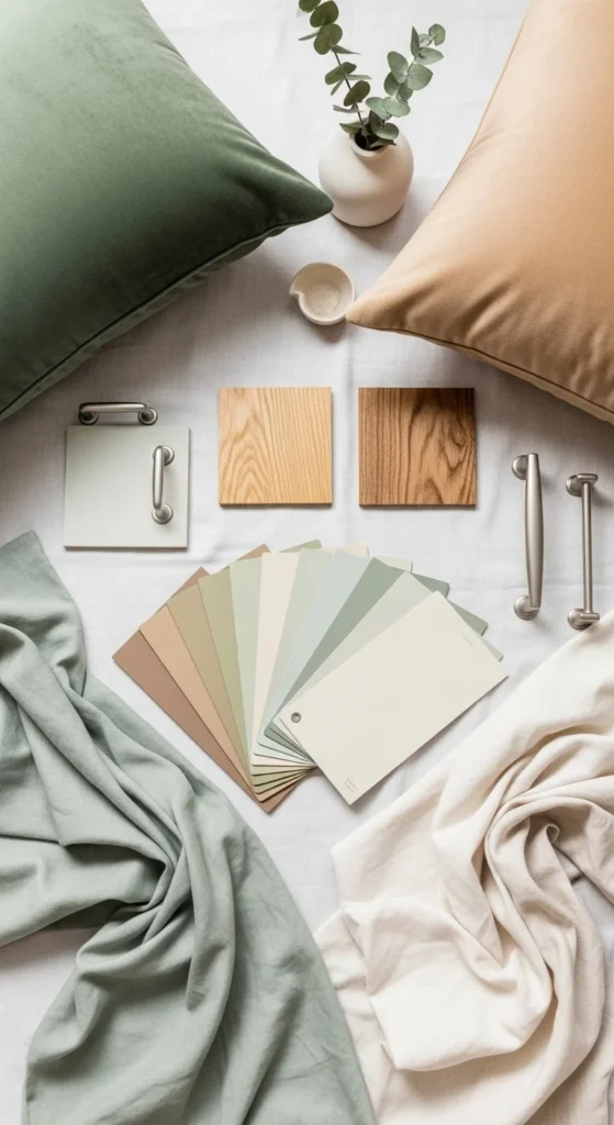
Add a Secondary Color That Supports It
After choosing your main shade, bring in a secondary color that complements it instead of competing with it. This second color should support the overall look and help create dimension.
Some easy bedroom color pairings include:
- Sage green + warm beige
- Dusty blue + soft gray
- Blush + cream
- Taupe + muted olive
- Navy + warm white
- Terracotta + sand
A good rule is to let the secondary color appear a little less often than the main one. It should feel like a partner, not a rival.
If your walls are soft beige, for example, your secondary color might appear in pillows, a throw blanket, artwork, or upholstered furniture.
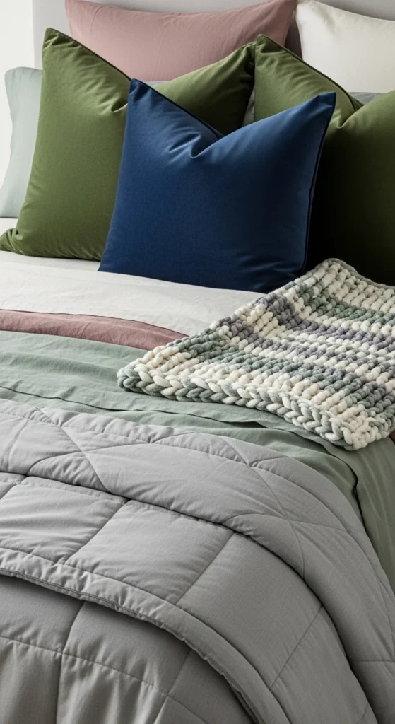
Use an Accent Color for Contrast
This is where the bedroom starts to feel interesting. An accent color adds personality and keeps the palette from looking too flat or predictable.
Accent colors work best in small doses, such as:
- Throw pillows
- Art frames
- A bench or chair
- Decorative objects
- Lamps
- Patterned bedding details
Some beautiful bedroom accent ideas are:
- Black for modern contrast
- Rust for warmth
- Mustard for a subtle pop
- Deep olive for richness
- Dusty rose for softness
- Brass or gold tones for warmth and shine
The key is restraint. You usually only need one accent color to make the room feel styled.
Too many accent shades can make the room look busy fast.
Follow the 60-30-10 Rule
If you are unsure how much of each color to use, the 60-30-10 rule is a very helpful guide.
Here is how it works:
- 60% = your main color
- 30% = your secondary color
- 10% = your accent color
It does not have to be exact, but it creates a nice visual balance.
For example:
- 60% warm white and beige through walls, bedding, and rug
- 30% sage green through curtains, pillows, and art
- 10% black or rust through decor accents and lighting
This formula keeps the room feeling cohesive rather than overloaded.
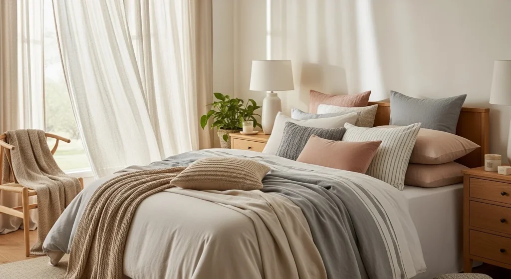
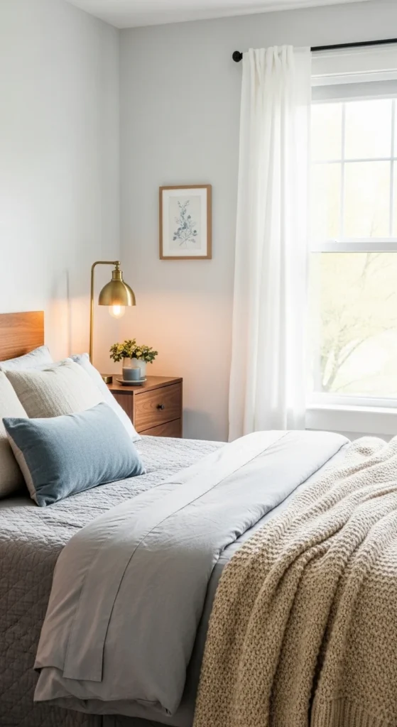
Mix Warm and Cool Tones Carefully
Bedrooms often look more designer-styled when they mix warm and cool shades, but the mix needs to feel intentional.
For example:
- A cool gray bedroom can feel warmer with beige, brass, or wood accents
- A warm blush and cream palette can feel more grounded with charcoal or dusty blue
- A navy bedroom can feel lighter with warm white and natural oak
This balance keeps the room from feeling too icy or too orange.
A simple trick is to choose one side to dominate. Either let warm tones lead and use cool tones sparingly, or do the opposite. That way the room still feels unified.
Let Neutrals Tie Everything Together
Neutrals are the secret weapon in almost every beautiful bedroom. They give the eye a place to rest and connect all the other colors in the room.
Helpful neutrals include:
- White
- Cream
- Beige
- Taupe
- Greige
- Soft gray
You can use neutrals in:
- Walls
- Bedding
- Rugs
- Upholstery
- Curtains
- Furniture
If you are mixing multiple colors, neutrals help soften the overall look and prevent things from feeling too loud.
Even a colorful bedroom usually looks best when at least half of the room stays grounded in neutral shades.
Use Patterns the Smart Way
Patterns can help mix colors beautifully, but they need a little control. A floral duvet, striped cushion, or patterned rug can connect multiple colors in one piece and make the room feel layered.
To keep patterns from taking over:
- Repeat colors that already exist in the room
- Mix large and small-scale prints
- Keep some solids in the space for balance
- Limit yourself to two or three pattern styles
For example, a floral pillow with sage, beige, and blush can help tie together the whole palette. Then you can use solid bedding and one striped throw to keep everything feeling balanced.
Patterns should support the palette, not dominate it.
Add Texture So the Colors Feel Richer
Sometimes a room does not need more color. It just needs more texture.
Texture makes similar tones feel more interesting and luxurious. This is especially important in bedrooms, where you want the space to feel soft and layered.
Try mixing:
- Linen sheets
- Velvet pillows
- Quilted blankets
- Woven baskets
- Upholstered headboards
- Wood furniture
- Ceramic decor
When the textures vary, the colors feel deeper and more dimensional.
Repeat Colors Around the Room
A bedroom feels cohesive when the same colors show up in more than one place. This creates flow and makes the palette feel intentional.
For example:
- Repeat sage green in pillows, artwork, and a plant
- Repeat rust in a throw blanket, a lamp base, and framed art
- Repeat navy in curtains, bedding trim, and a bench
This does not mean matching everything perfectly. It simply means letting the eye notice a rhythm throughout the room.
That is often what separates a polished bedroom from one that feels unfinished.
The Takeaway
Mixing colors in a bedroom does not have to be overwhelming. Start with one main color, add a secondary shade that supports it, and finish with a small accent color for contrast. Use neutrals to create breathing room, repeat your colors across the space, and lean on texture to make everything feel richer.
The best bedrooms are not filled with random pretty colors. They are built with intention, balance, and a palette that feels connected from corner to corner.
Emma Harper is a New Jersey-based guest contributor, mom to a two-year-old girl, and lover of gardening, crochet, and interior design. She enjoys sharing creative ideas that bring handmade charm, cosy style, and practical inspiration into everyday home life.