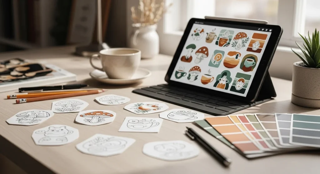
You know that feeling when a sticker instantly clicks you don’t even think, you just want it on your laptop, journal, or phone case? That’s not luck. That’s intentional design.
Designing aesthetic stickers like a pro is about more than cute drawings. It’s about composition, color psychology, and understanding what feels human and current especially with 2026 trends leaning toward imperfect authenticity and nature-inspired visuals.
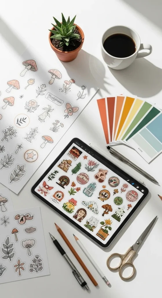
Let’s break it down step by step so you can create stickers that look polished, scroll-stopping, and totally sellable.
Start With One Strong Focal Point
Every professional sticker has one clear hero.
If everything is trying to be loud, nothing stands out. The first rule pros follow is focal point dominance, one main element that grabs attention instantly.
Your focal point can be:
- A bold illustration
- A short phrase or word
- A symbol (sun, mushroom, smiley, flower, logo)
Pro tip: Shrink your design until it’s tiny. If you can still recognize the main idea, your focal point is working.
Avoid:
- Multiple messages competing
- Too many characters or icons
- Overloaded backgrounds
Simple doesn’t mean boring, it means confident.
Use Negative Space Like a Designer (Not a Beginner)
One of the biggest mistakes beginners make? Filling every inch.
Professional designers intentionally leave 30–40% negative space. This breathing room:
- Frames your focal point
- Makes designs feel premium
- Improves readability at small sizes
Think of negative space as silence in music it makes the melody hit harder.
Quick checklist:
- Can your design “rest” visually?
- Does it feel crowded when printed small?
- Would removing one element improve it?
If yes, remove it.
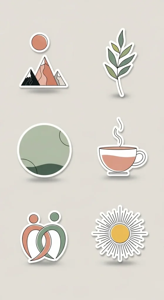
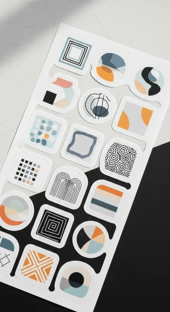
Choose a Limited Color Palette (Then Commit)
Aesthetic stickers almost always use 2–3 main colors. Limiting your palette instantly makes your work look intentional and professional.
Smart color strategies:
- Use complementary colors (opposites on the color wheel) for contrast
- Add black or white for balance
- Test your design in black & white—if it still works, you’re golden
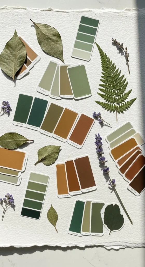
Trending for 2026:
- Earthy greens, browns, sand tones
- Muted pastels with warm undertones
- Nature-inspired palettes (biophilic design)
Avoid rainbow overload. Restraint = professionalism.
Embrace Imperfect, Hand-Drawn Aesthetics
Perfect vectors are out. Human imperfections are in.
The anti-AI, “imperfect by design” look is one of the strongest sticker trends right now. Think:
- Wobbly hand-drawn lines
- Rough brush strokes
- Uneven shapes
- Slight texture or grain
This raw aesthetic builds emotional connection. It feels personal, not mass-produced.
You can create this look digitally by:
- Using textured brushes in Canva or Procreate
- Adding subtle noise or paper grain
- Drawing by hand, then scanning or photographing
Authenticity beats perfection every time.
Make Typography Do the Heavy Lifting
If your sticker includes text, typography becomes the design.
Pro font pairing rules:
- Bold serif + light sans-serif
- Chunky display font + simple supporting text
- Custom or organic fonts for personality
Keep it readable:
- Avoid thin fonts at small sizes
- Add a white outline or stroke for contrast
- Don’t stretch or over-decorate letters
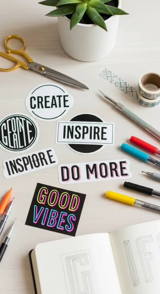
Typography should feel intentional, not like an afterthought.
Design for Printing, Not Just Screens
What looks good on screen doesn’t always print well. Professional sticker designers always think ahead:
- Add borders or margins to frame designs
- Use white outlines so stickers pop on dark surfaces
- Include stroke cut lines for clean trimming
- Design in sticker sheets with a clear theme
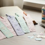
Kiss-cut sticker sheets (A6 size works great) feel cohesive and sell better than random singles. Bonus points if your theme tells a story mood-based packs feel curated and premium.
Scale Like a Pro With Smart Variations
Once you have a strong base design, pros don’t reinvent; they iterate.
Create variations by:
- Changing colorways
- Swapping words while keeping layout
- Seasonal or event-based versions
AI-assisted tools can help generate variants faster, but the creative direction should always be yours. Consistency builds a recognizable style and that’s how sticker brands grow.
Final Takeaway: Design Less, Think More
Aesthetic sticker design isn’t about adding more. It’s about:
- One strong focal point
- Intentional space
- Thoughtful color
- Human imperfections
- Print-ready details
When your stickers feel clear, calm, and confident, people don’t just like them—they keep them.
Save this guide for later, open your design tool, and start creating stickers that actually feel professional ✨
Lily Summers is a digital artist and creative storyteller who loves bringing colorful characters to life. With a passion for cartoons, fan art, and playful sketches, she inspires others to explore their imagination through art. When she’s not sketching, you’ll find her dreaming up new ideas for CraftedWizard.com to spark creativity in every artist. 🌈✨