Color can make a room feel happy, fresh, and full of personality. But there is a fine line between a space that feels beautifully styled and one that feels overwhelming the second you walk in. The good news is that decorating with color does not mean painting every wall bright blue or filling every corner with bold patterns. A few smart choices can go a long way.
If you want your home to feel lively but still calm and pulled together, the trick is learning how to use color with intention. Think balance, contrast, and little moments of fun instead of color chaos.
Start With a Neutral or Soft Base
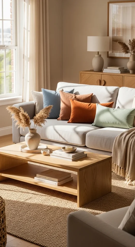
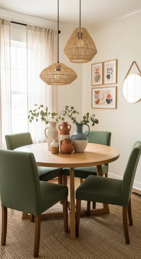
One of the easiest ways to use color without overdoing it is to begin with a calm foundation. That does not mean your room has to be plain. It just means your biggest pieces should create balance.
A soft base could include:
- White, cream, beige, or light gray walls
- Natural wood furniture
- A neutral sofa or bed
- Simple rugs or curtains in light tones
When the larger elements are grounded, colorful accents stand out in a much prettier way. This also keeps the room from feeling too busy.
A neutral base gives you freedom. You can add color now, switch it later, and update the look seasonally without replacing everything.
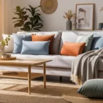
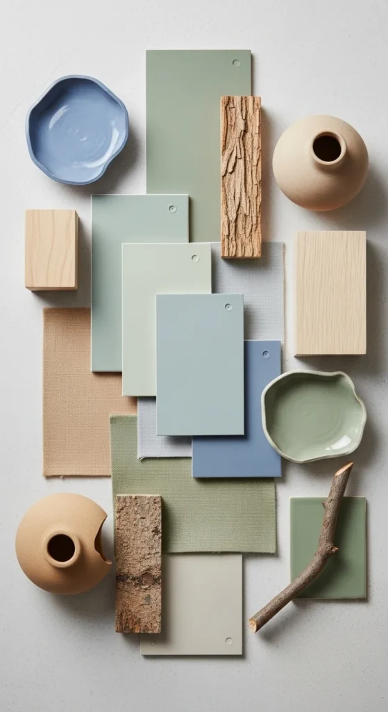
Pick a Small Color Palette and Stick to It
One common mistake is mixing too many colors at once. That is usually when a space starts to feel cluttered or random.
Instead, choose a simple palette of 2–3 main colors and repeat them throughout the room. For example:
- Sage green + dusty blue + warm beige
- Rust + blush + cream
- Navy + olive + tan
- Terracotta + soft pink + ivory
This helps the room feel cohesive instead of chaotic.
You can also use the 60-30-10 rule as a simple guide:
- 60% main color or base tone
- 30% secondary color
- 10% accent color
You do not have to follow it perfectly, but it is a helpful way to think about balance.
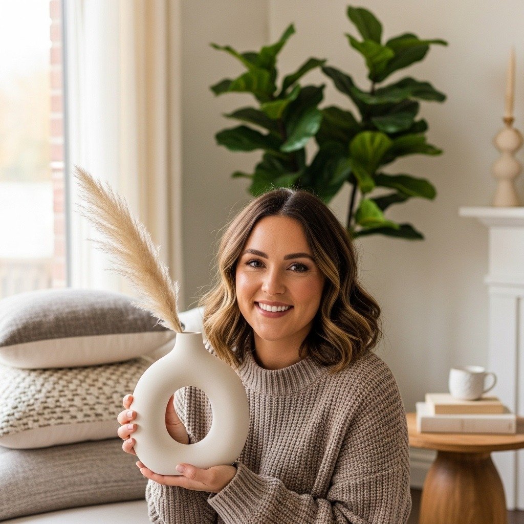
Add Color Through Decor, Not Everything at Once
If you are nervous about color, start small. Decorative pieces are the easiest and safest place to experiment.
Try adding color through:
- Throw pillows
- Blankets
- Artwork
- Lampshades
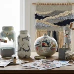
- Vases
- Books
- Small decor objects
- Bedding
- Table runners or placemats
These pieces bring personality into the room without making the space feel permanent or heavy.
This approach is especially helpful if you are still figuring out what colors you love. You can test different looks without committing to a painted wall or a bold sofa.
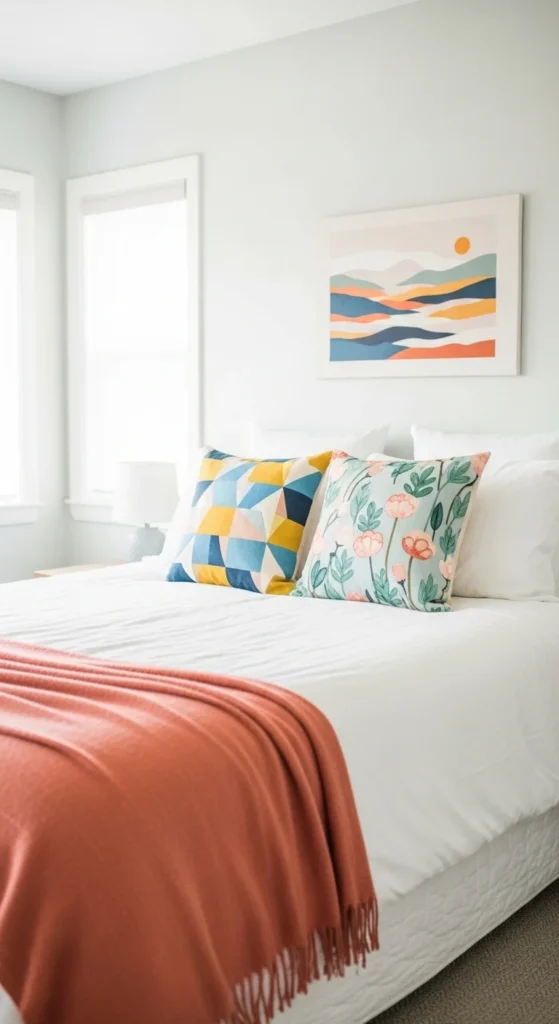
Use One Statement Piece Per Area
A colorful room often works best when one item takes the spotlight and everything else supports it. This creates a focal point instead of visual competition.
That statement piece could be:
- A bold armchair
- A colorful piece of art
- A patterned rug
- A painted dresser
- Bright dining chairs
- A dramatic headboard
Once you choose your star piece, keep the surrounding decor a little calmer. That way the color feels intentional and stylish, not loud.
For example, if you have a rich blue velvet chair, let that be the hero. Add a few smaller blue accents nearby, but do not compete with it using five more bold colors in the same corner.
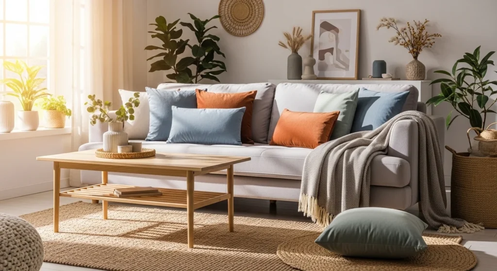
Mix Bold Colors With Natural Materials
One of the best ways to soften color is by pairing it with organic textures. Natural materials help bright shades feel warm and grounded.
Try combining colorful decor with:
- Light or medium-toned wood
- Woven baskets
- Linen fabrics
- Jute rugs
- Stone or ceramic pieces
- Plants and greenery
This balance keeps the room feeling fresh and relaxed instead of overly styled.
Keep Patterns Controlled
Patterns can add so much charm, but too many bold prints at once can quickly overwhelm a room. If you are using color through patterns, choose them carefully.
A simple way to make patterns work:
- Mix one larger-scale print with one or two smaller subtle patterns
- Keep at least one pattern grounded in a neutral tone
- Repeat one or two colors across all prints
- Leave some solid-colored areas to give the eye a break
For example, floral curtains, a striped pillow, and a textured solid throw can work beautifully together when the colors relate to each other.
The goal is layered, not crowded.
Use Color Where You Want Energy
Not every room needs the same amount of color. Think about how you want each space to feel.
Here is a simple way to approach it:
- Living room: warm, friendly, balanced color
- Bedroom: softer, calming tones
- Kitchen: cheerful pops of color
- Home office: energizing but focused shades
- Entryway: a fun first impression
This helps you decorate with purpose instead of randomly placing color everywhere.
If you love bold tones, use them where energy makes sense. In relaxing spaces, softer or more muted shades usually work better.
Leave Breathing Room
One of the most important tips is also the simplest: not every surface needs color.
Let some parts of the room stay quiet. Empty space, neutral backgrounds, and simple styling help colorful moments stand out more.
A few ways to create breathing room:
- Keep walls or large furniture more subtle
- Avoid over-accessorizing shelves
- Use negative space around colorful art
- Limit the number of bright objects on one surface
Color feels more elevated when it has room to shine.
The Takeaway
Decorating with color does not have to mean going bold in every direction. In fact, the most beautiful colorful spaces usually feel balanced, layered, and thoughtfully edited.
Start with a soft base, choose a small palette, add color in focused ways, and let natural textures keep everything grounded. That is how you get a home that feels full of life without feeling too busy.
Save this idea for later and use it as your guide the next time you want to bring more color into your home without overdoing it.