
The right bedroom color scheme can completely change how your space feels. It can make a small room feel lighter, a plain room feel polished, and a busy life feel a little calmer at the end of the day. But choosing colors for a bedroom can also feel surprisingly tricky. Do you go soft and airy? Warm and cozy? Dark and dramatic? Or something timeless that will still feel beautiful a year from now?
The good news is that you do not need to guess. A balanced bedroom color scheme usually comes down to a few simple ideas: choosing the mood first, keeping the palette focused, and layering colors in a way that feels natural instead of forced.
Start With the Mood You Want
Before picking paint swatches or shopping for bedding, think about how you want your bedroom to feel. This step matters more than people realize.
Your bedroom might need to feel:
- Calm and restful
- Warm and cozy
- Bright and fresh
- Elegant and romantic
- Moody and dramatic
Once you know the mood, the colors become easier to choose.
For example:
- Calm and restful: soft blue, sage, warm white, muted gray
- Warm and cozy: taupe, beige, clay, caramel, creamy white
- Bright and fresh: white, pale green, soft blush, light beige
- Moody and dramatic: charcoal, deep green, navy, rich brown
Instead of asking, “What color is trending?” ask, “What feeling do I want every time I walk into this room?”
That question usually leads to better choices.
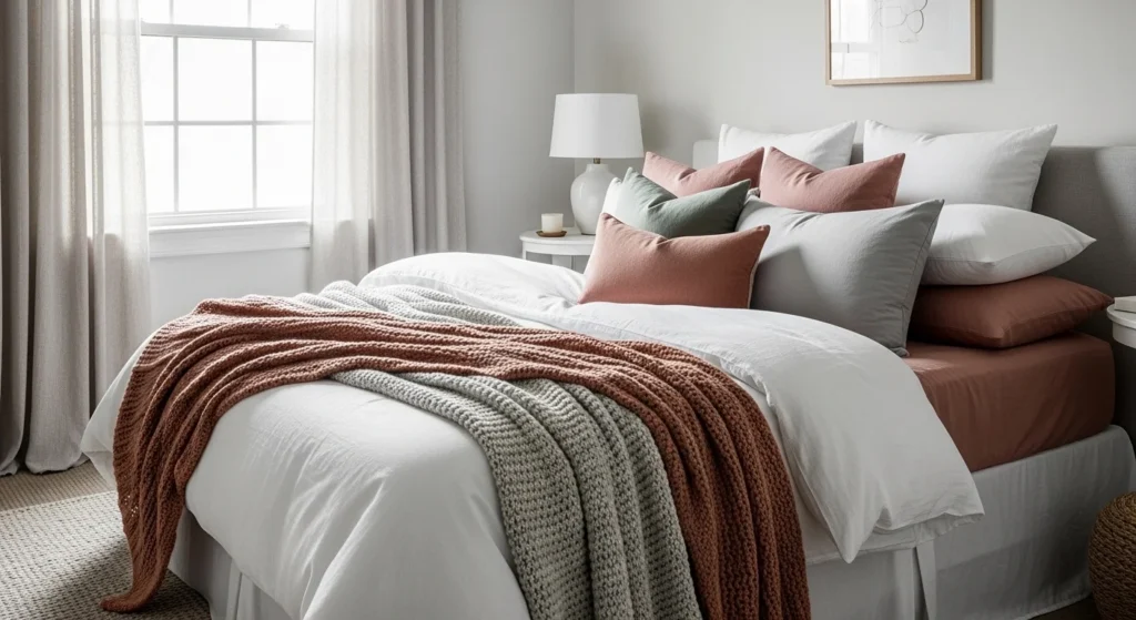
Choose a Main Color, a Secondary Color, and an Accent
A bedroom feels balanced when the color palette is simple and intentional. You do not need six or seven different shades fighting for attention.
A very easy formula is this:
- Main color: the dominant tone in the room
- Secondary color: supports the main color
- Accent color: adds contrast or personality
Here is what that can look like:
- Warm white + beige + muted olive
- Soft gray + dusty blue + charcoal
- Cream + blush + warm wood tones
- Taupe + sage + black accents
This kind of structure keeps the room feeling cohesive.
Try to let your main color do most of the work. The secondary color should support it, and the accent color should show up in smaller ways like pillows, art, throws, or decor.
Think About Light in the Room
Lighting changes color more than most people expect. A paint color that looks soft and beautiful in one room can look dull, cold, or too dark in another.
Pay attention to:
- Natural light
- Room size
- Window direction
- Warm or cool artificial lighting
Rooms with lots of natural light can usually handle deeper or moodier colors better. Darker bedrooms often look best with lighter, warmer shades that help the space feel open and cozy instead of heavy.
A few general tips:
- North-facing rooms can make colors look cooler
- South-facing rooms often make colors feel warmer
- Small bedrooms usually feel best with soft, airy tones
- Large bedrooms can handle richer color combinations
Always test colors in your actual room before committing. What looks perfect on a tiny sample can feel very different once it is on the wall or spread across a bed.
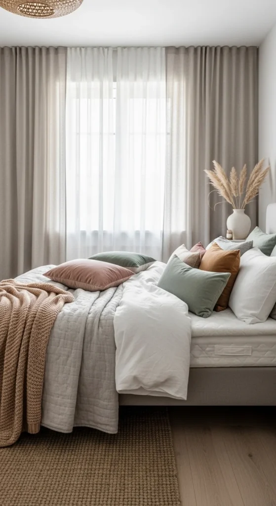
Use Neutrals to Create Balance
Even if you love color, neutrals are what usually make a bedroom feel calm and polished. They give the eye a place to rest and help stronger shades feel more intentional.
Beautiful bedroom neutrals include:
- Warm white
- Cream
- Beige
- Taupe
- Greige
- Soft gray
- Mushroom tones
You can use neutrals as:
- Wall colors
- Bedding basics
- Rugs
- Curtains
- Furniture finishes
Then layer your accent shades on top.
This is one of the easiest ways to create a room that feels colorful enough to be interesting but soft enough to still feel restful.

Match the Color Scheme to Your Style
Your color palette should work with the decorating style you actually love. The same blue can feel coastal, modern, classic, or romantic depending on what surrounds it.
Here are a few examples:
Soft and Minimal
- White
- Warm beige
- Light gray
- Muted olive
Cozy and Earthy
- Clay
- Camel
- Cream
- Olive green
Elegant and Classic
- Soft taupe
- Dusty blue
- Ivory
- Black accents
Feminine and Airy
- Blush
- Warm white
- Light wood
- Pale sage
Moody and Modern
- Charcoal
- Deep forest green
- Walnut wood
- Crisp white
When the color scheme matches the style of your furniture, textiles, and decor, the room feels much more put together.
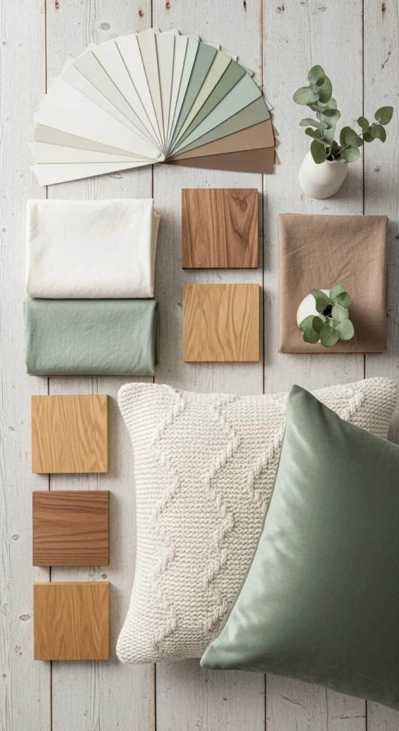
Add Depth With Texture, Not Just More Color
A beautiful bedroom does not need to rely on bold color alone. In fact, many of the prettiest bedrooms use fairly simple palettes but feel rich because they include lots of texture.
Bring in depth through:
- Linen bedding
- Quilted blankets
- Velvet pillows
- Woven baskets
- Upholstered headboards
- Natural wood furniture
- Soft rugs
- Ceramic lamps or decor
Texture makes similar colors feel layered instead of flat.
So if your room is mostly cream, beige, and soft green, that can still feel incredibly interesting when the materials vary.

Keep Bold Colors in the Right Places
Bold colors can absolutely work in a bedroom, but they usually look best when they are used with intention.
Instead of covering every surface in a strong shade, try using bold color in:
- An accent wall
- Throw pillows
- Artwork
- A bench or chair
- Curtains
- A patterned rug
This keeps the room balanced.
If you fall in love with a dramatic shade like navy, emerald, or terracotta, let it play a supporting role unless you truly want a bold, moody look. A little can go a long way in a bedroom.
Make Sure Everything Connects
A balanced room feels like all the pieces belong together. That does not mean everything has to match perfectly, but the colors should relate to each other.
A few easy ways to create flow:
- Repeat one accent color in at least two or three places
- Keep wood tones fairly consistent
- Choose metals that work well with the palette
- Avoid introducing too many extra colors through decor
- Let the bedding tie the whole room together
When colors repeat naturally across the space, the room feels calm and finished.
The Takeaway
Choosing a bedroom color scheme does not have to be overwhelming. Start with the mood you want, build a simple palette with a main color, a secondary color, and an accent, and use neutrals and texture to keep everything balanced.
The most beautiful bedrooms are not always the boldest. They are the ones that feel peaceful, cohesive, and comfortable to live in every day.
Save this for later and use it as your guide when planning a bedroom color scheme that feels both beautiful and balanced.