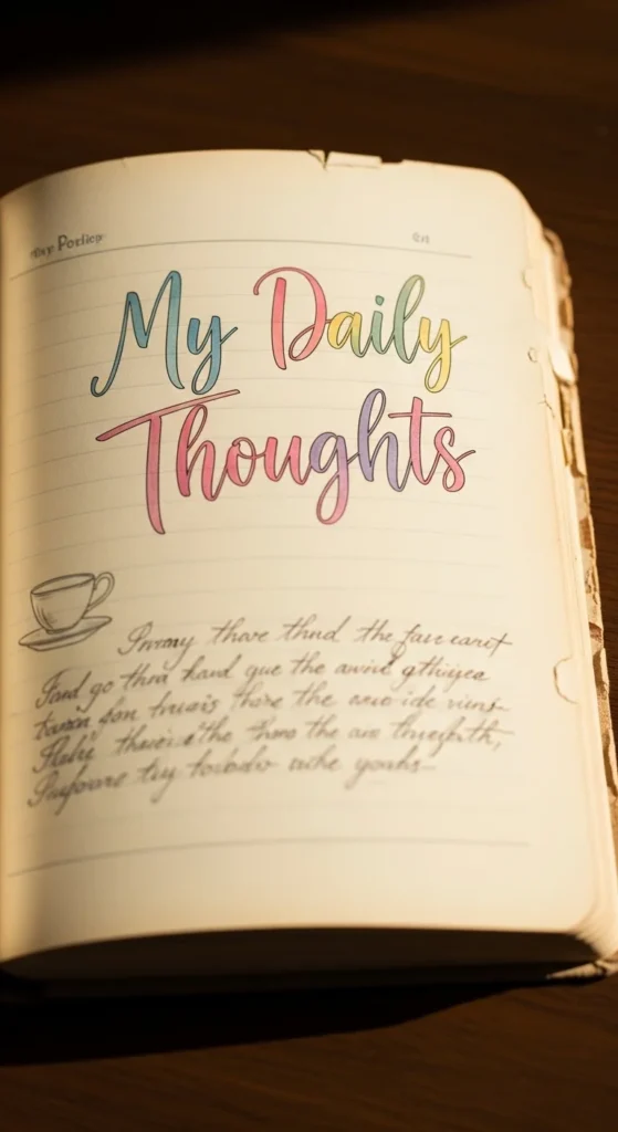
Aesthetic diary pages turn everyday thoughts into something beautiful to look back on. Soft colors, gentle layouts, and creative little details make journaling feel calm and inspiring. You don’t need expensive supplies or perfect handwriting to create pages that look Pinterest-worthy. With simple tools like pens, tape, paper scraps, and stickers, you can design spreads that feel personal, artistic, and soothing. These ideas focus on clean layouts, cozy color themes, and easy decorative touches that help your diary feel like a creative escape instead of a chore.
1. Minimal Pastel Weekly Spread
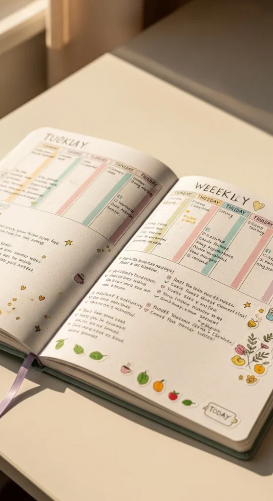
A pastel weekly spread gives your diary a calm and balanced look. Use light shades like blush pink, soft blue, or lavender to mark each day of the week. Draw simple boxes with a ruler or freehand lines for a relaxed feel. Add tiny icons like stars or dots instead of big decorations so the page stays airy. Leave white space around each section so writing doesn’t feel crowded. Budget tip: Use colored pencils or mild highlighters instead of special markers. This layout helps you stay organized while still looking soft and pretty. It’s perfect for beginners because it relies on color and spacing rather than complicated designs.
2. Washi Tape Header Dividers
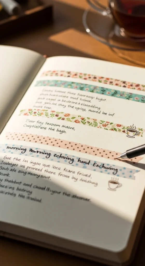
Washi tape headers instantly make pages look styled with very little effort. Tear or cut short strips of tape and place them across the top of sections as title bars. Write over the tape with a pen or marker. Choose two or three matching colors so the page looks coordinated. Budget tip: If you don’t have washi tape, use masking tape colored lightly with markers. This trick creates structure and decoration at the same time, keeping layouts tidy and aesthetic.
3. Mood Color Tracker Wheel
A mood color wheel turns your feelings into a soft visual pattern. Draw a large circle and divide it into small slices, one for each day of the month. Choose a gentle color palette and assign each shade to a mood. Fill in one slice daily. Over time, the wheel becomes a calm, abstract snapshot of your emotional patterns. Keep lines thin so the page feels light. Budget tip: Use colored pencils and blend lightly for a smooth finish. You can add a tiny legend in the corner with color dots instead of long labels. This layout looks artistic while staying simple to maintain. It’s especially nice for self-reflection without writing long entries every day.
4. Matcha Green Theme Page
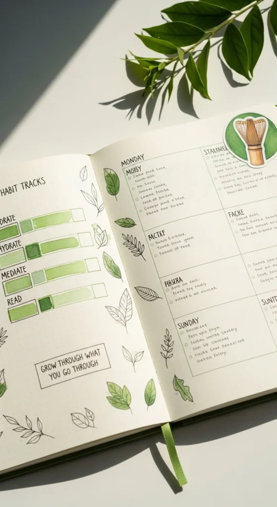
A matcha green theme gives your page a grounded, cozy vibe. Use soft green shades for borders, headings, and tiny doodles. Draw simple leaf shapes along one edge or corner. Keep the rest of the page neutral so the green stands out gently. Budget tip: Mix green and yellow pencil to create different tones without extra supplies. This color theme pairs well with nature thoughts, quiet routines, or calm weekend reflections. Limiting your palette to one main color keeps the page looking styled and cohesive.
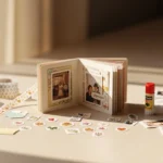
5. Snapshot of Me Page
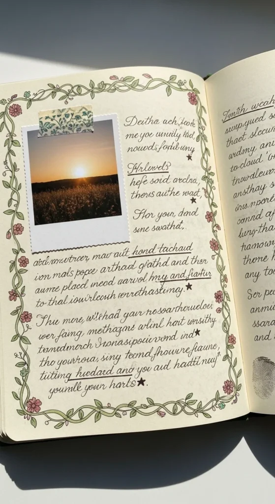
A snapshot page captures who you are in this moment. Glue a small photo of yourself on one side. Around it, write short notes about current favorites, thoughts, or habits. Add a thin border or a few tiny doodles for balance. Budget tip: Print photos in mini size on regular paper and glue onto thicker scraps. This page becomes a time capsule you’ll love revisiting later.
6. Gold Accent Corner Details
A gold accent corner adds a soft glow without making the page busy. Use a metallic pen to draw tiny stars, dots, or thin lines in one or two corners. Outline a small quote or header for extra shine. Budget tip: Layer yellow and brown pencil lightly if you don’t have metallic ink. Small touches of gold make pastel or neutral spreads feel polished and Pinterest-ready.
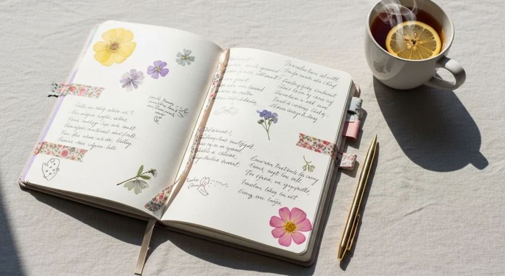
7. Vellum Overlay Quote Page
A vellum overlay creates a delicate layered effect. Place a translucent sheet over a decorated page and write a short quote on it. Secure the top edge with washi tape so it flips open. The page underneath can hold photos, doodles, or soft color washes. Budget tip: Use baking paper or tracing paper instead of vellum. This adds dimension while keeping the design airy and light.
8. Tiny Habit Icon Tracker
A tiny icon tracker turns habits into a cute visual grid. Draw small icons like water drops, books, or moons in rows. Color one each day you complete the habit. Keep icons simple and evenly spaced. Budget tip: Use a fine pen and colored pencils instead of stickers. The repeating shapes create a neat pattern that looks decorative and organized at the same time.
9. Soft Floral Doodle Border
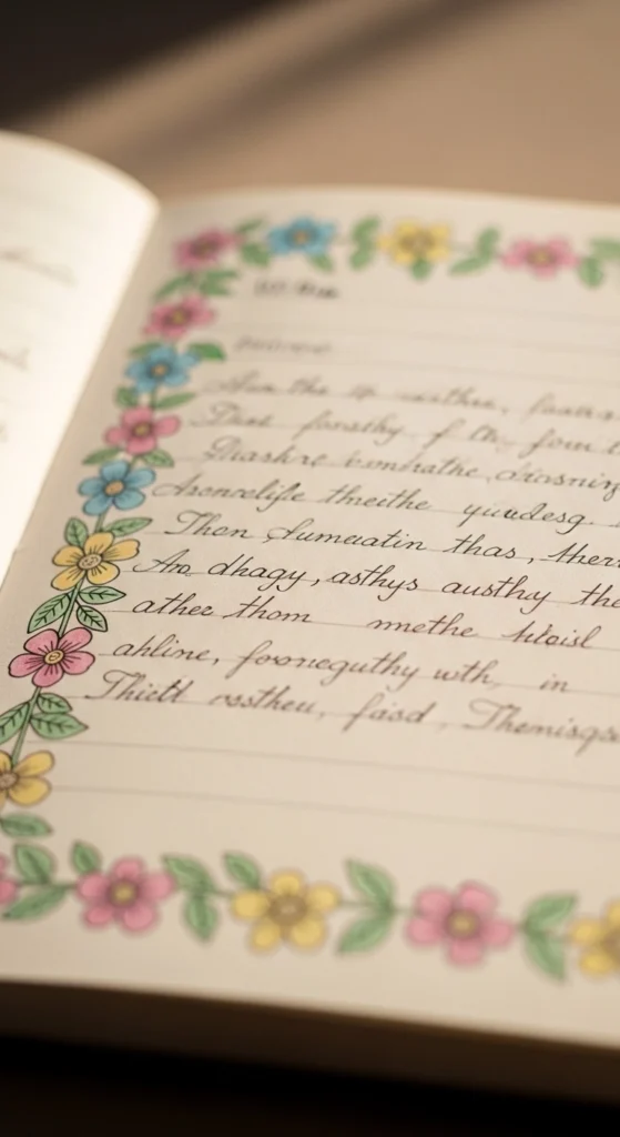
A floral doodle border gently frames your writing. Draw tiny flowers or leaves around the edges of the page. Use soft colors so the border stays subtle. Budget tip: Learn one easy flower shape and repeat it. This makes the page feel handmade and cozy without taking much time.
10. Pastel Sticky Note Layering
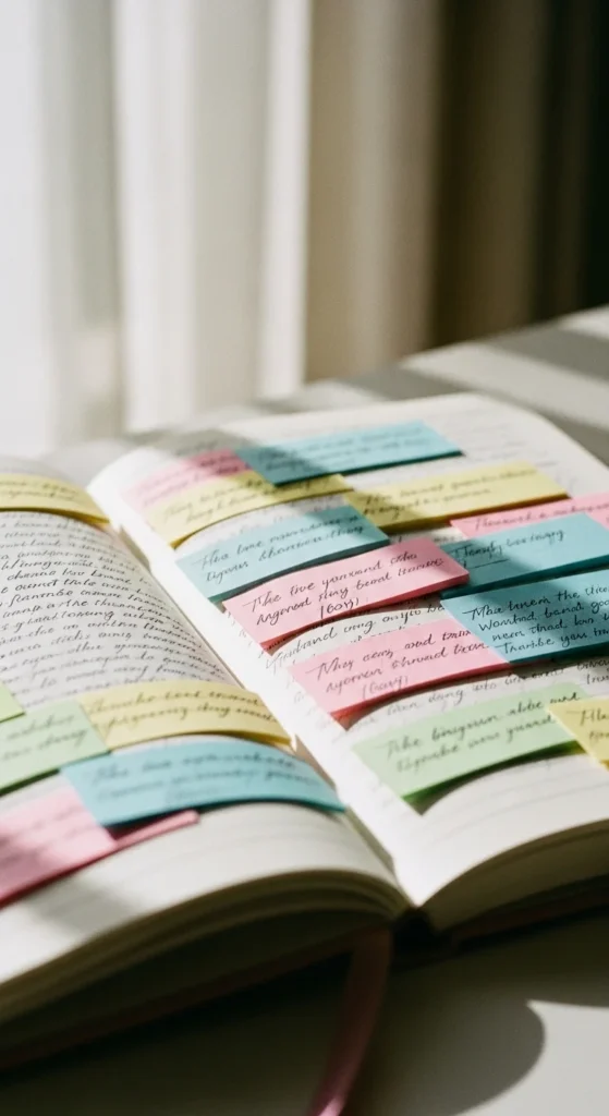
Layered sticky notes give your page soft dimension without making it busy. Choose two or three notes in gentle shades like peach, lilac, or pale blue. Overlap them slightly in one corner or along the side of your writing. Use each note for a short thought, quote, or reminder. Keeping the notes small helps the layout stay clean and balanced. If the colors feel too bold, lightly brush over them with a pale pencil to mute the tone. Budget tip: Cut rectangles from scrap paper and glue just the top edge so they flip up like real sticky notes. This look adds cozy texture and makes your journal feel interactive and relaxed.
11. Daily Highlight Line Page
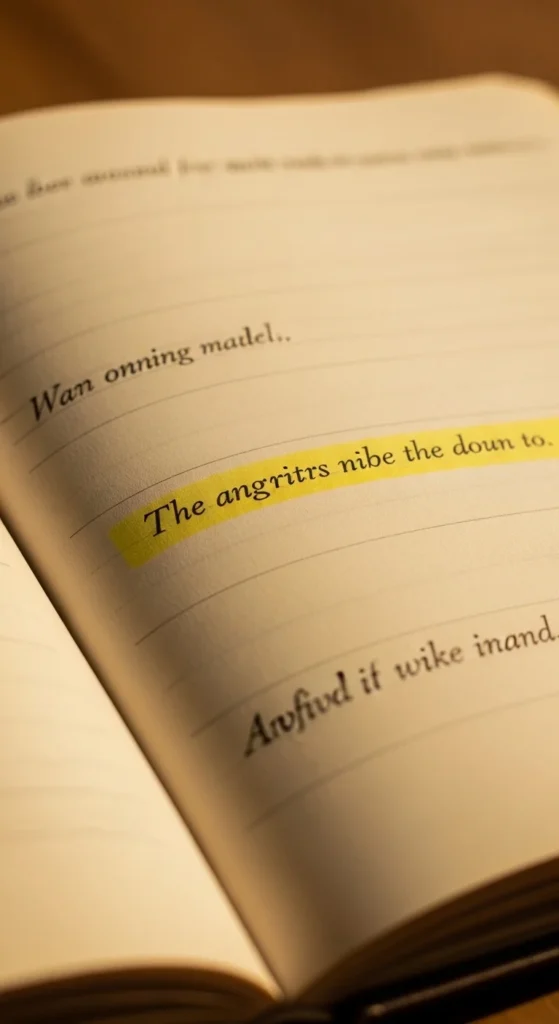
A daily highlight line keeps journaling simple and meaningful. Write one sentence that sums up the best moment of your day. Place it in the center or slightly above the middle of the page. Add a soft underline, a thin box, or a tiny star beside it for emphasis. Leave plenty of blank space around the sentence so it stands out. Budget tip: Use a mild highlighter or colored pencil to create a soft glow behind the line. This layout is perfect for busy days when you still want to keep the journaling habit alive. Over time, flipping through these pages feels like reading a collection of small, happy memories.
12. Soft Watercolor Corner Wash
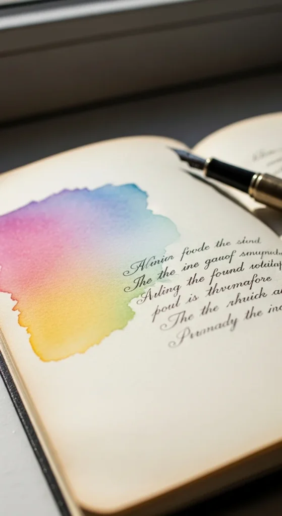
A corner watercolor wash adds color while keeping the page open and calm. Dip a brush in diluted paint and gently sweep it into one corner of the page. Let the color fade naturally toward the center. Keep writing on the blank side so the wash feels like a background accent rather than decoration. Budget tip: Use children’s watercolor sets or even diluted marker ink. If you want a softer effect, dab the wet area with tissue to lift some pigment. This technique gives pages a dreamy look without extra stickers or layers.
13. Quote Cloud Bubble Layout
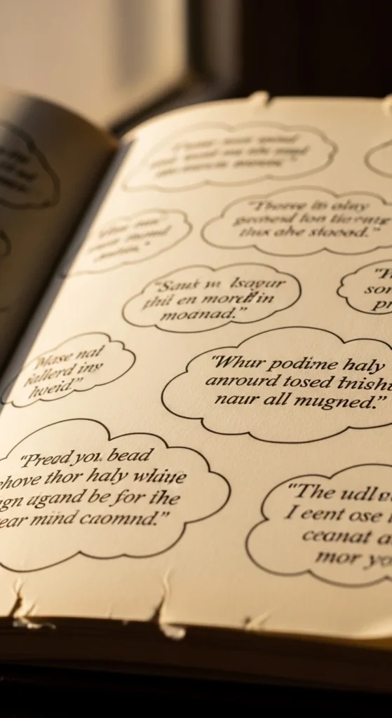
A quote cloud layout collects favorite lines in a soft and playful way. Draw light cloud or speech-bubble shapes across the page. Write one quote inside each shape. Keep outlines thin and rounded so the page feels gentle. Space the clouds so there is breathing room between them. Budget tip: Sketch shapes lightly in pencil before tracing with pen. This style works well for affirmations, song lyrics, or comforting thoughts you want to remember.
14. Monthly Memory Collage Strip
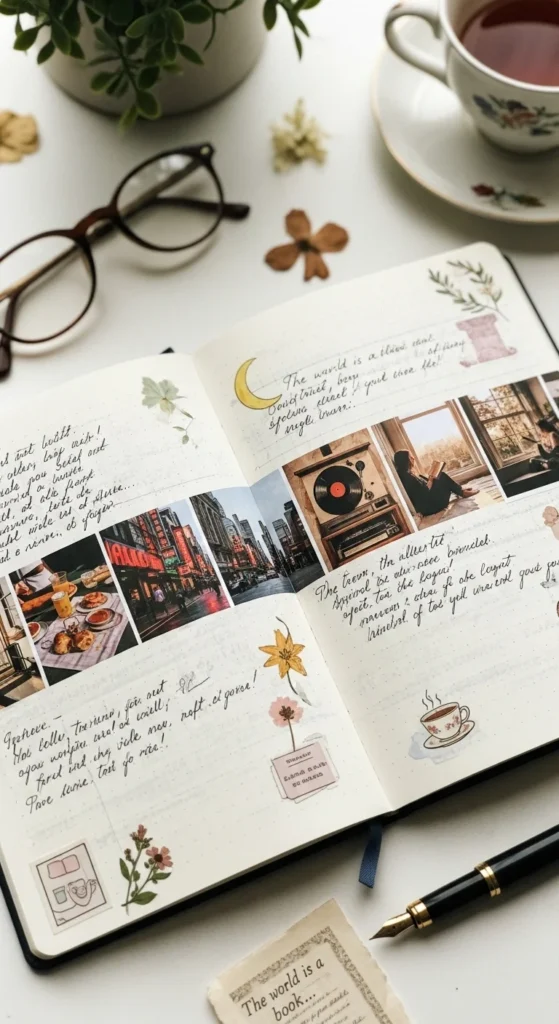
A memory collage strip uses one narrow band to show multiple moments. Print several tiny photos and glue them side by side in a straight line across the page. Add short dates or single-word captions under each one. Leave the top and bottom of the page mostly empty to keep the layout clean. Budget tip: Print low-ink photos at home on regular paper, then trim with simple scissors. This layout feels organized and modern while still showing a variety of memories from the month.
15. Neutral Beige Theme Spread
A neutral beige theme creates a calm and cozy atmosphere. Use soft browns, cream shades, and thin black lines. Add tiny line doodles like leaves or simple frames. Keep colors muted and avoid bright accents. Budget tip: Blend brown and white colored pencils to make different tones. This palette makes pages feel warm, balanced, and easy on the eyes.
16. Tiny Star Scatter Page
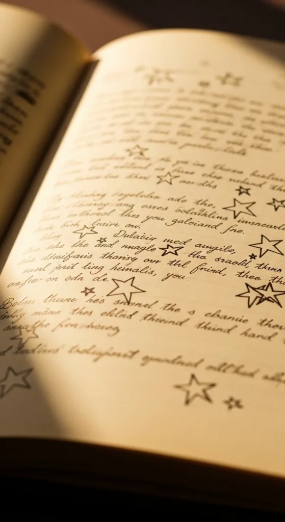
A star scatter design adds a touch of soft charm. Draw tiny stars spaced lightly around your writing. Keep them small and evenly spread so the page doesn’t feel crowded. Use one color for a clean look. Budget tip: Try a metallic or white pen for a subtle shimmer effect. This simple detail makes plain pages feel magical.
17. Gratitude Three-Line Layout
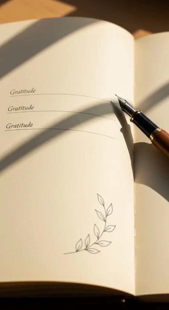
A three-line gratitude layout keeps reflection short and meaningful. Draw three evenly spaced lines. Write one thing you’re thankful for on each line. Add a tiny heart or dot beside each entry. Keep the rest of the page blank so the words stand out. Budget tip: Repeat this layout daily to create a neat visual rhythm across your journal.
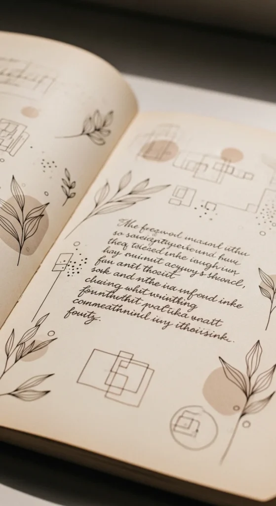
18. Soft Grid Reflection Page
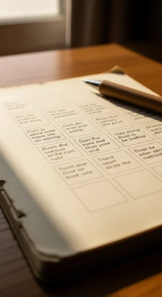
A grid reflection page organizes thoughts into neat sections. Draw a light grid using pencil so the lines stay soft. Write a short reflection in each box. You can label rows for different topics like work, home, or feelings. Budget tip: Use a ruler and keep spacing even for a tidy look. This layout feels structured but still gentle and creative.
19. Tea Stain Vintage Accent
A tea stain accent gives paper a warm aged tone. Lightly brush diluted tea onto the edges of the page and let it dry fully. Keep the center clean for writing. Budget tip: Test the stain on scrap paper first to control color depth. This detail adds cozy texture and works beautifully with neutral themes.
20. Minimal Black Line Frame
A black line frame makes any page look neat and finished. Draw a thin border around the edge of the page. Keep all writing and decoration inside the frame. Budget tip: Use a ruler for straight edges or freehand for a softer look. This simple outline helps anchor the layout visually.
21. Pocket Fold Memory Note
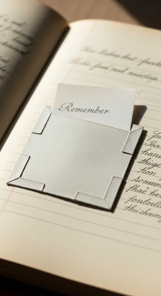
A pocket fold note hides a small memory inside your spread. Fold a square of paper and glue three sides to the page to form a pocket. Slip in a short note, ticket stub, or tiny drawing. Keep the pocket small and off to one side so it doesn’t overwhelm the page. Budget tip: Use magazine pages or scrap paper for color variety.
22. Soft Brush Letter Title Page
A brush letter title gives your spread a strong focal point. Write the month, mood, or theme in large soft lettering at the top of the page. Keep the rest of the design minimal so the lettering stands out. Budget tip: Practice strokes on scrap paper first using a brush pen or marker. This creates a stylish header without extra decoration.
23. Tiny Leaf Trail Divider
A leaf trail divider gently separates different sections of writing. Draw a thin curved line and add tiny leaves along it. Keep the leaves small and evenly spaced. Budget tip: Use one green pencil shade for a clean look. This adds movement and softness to your page.
24. Soft Pastel Sticker Cluster
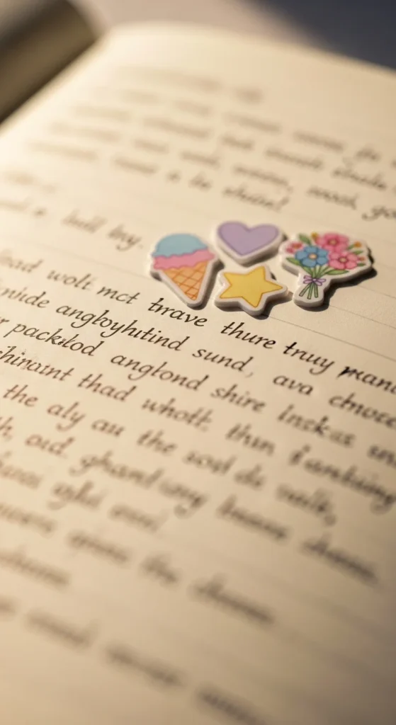
A pastel sticker cluster adds charm without clutter. Group three to five small stickers in one corner of the page. Leave the rest of the space open for writing. Budget tip: Cut shapes like circles or hearts from colored paper if stickers aren’t available. This creates a cute focal point while keeping the layout balanced and airy.
Conclusion
Aesthetic diary pages come from soft color choices, clean layouts, and small thoughtful details. You don’t need many supplies to create pages that feel beautiful and calming. Try one idea at a time and let your style grow naturally. The most important part is enjoying the process and creating a journal that feels personal and comforting to open.

Lily Summers is a digital artist and creative storyteller who loves bringing colorful characters to life. With a passion for cartoons, fan art, and playful sketches, she inspires others to explore their imagination through art. When she’s not sketching, you’ll find her dreaming up new ideas for CraftedWizard.com to spark creativity in every artist. 🌈✨