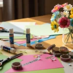
Aesthetic scrapbooking is all about turning everyday memories into pages that feel calm, balanced, and visually pleasing. Beautiful layouts don’t come from piling on decorations. They come from thoughtful spacing, soft color palettes, and layered textures that guide the eye naturally. Current styles lean toward botanical prints, gentle neutrals, and a mix of digital planning with hands-on crafting. Whether you’re working with printed photos, ticket stubs, or handwritten notes, these ideas help you design scrapbook pages that look polished without requiring advanced skills or expensive supplies.
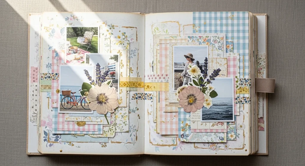
1. Gingham and Botanical Fusion
Pairing gingham with botanical prints creates a page that feels structured yet soft. Start with gingham as the base since its grid pattern adds quiet order. Layer a piece of floral paper behind your photo cluster to introduce organic movement. Keep colors within the same family, such as sage green and cream, so the patterns feel connected. Add a thin paper frame around your photos to help them stand out. Leave some open space so the patterns don’t compete for attention. This combination works well for outdoor memories, spring photos, or cozy home moments. It looks detailed but comes together with just two patterned papers and simple layering.
2. Soft Neutral Palette Page
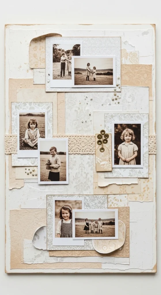
A neutral palette makes every page feel calm and cohesive. Choose papers in shades like beige, cream, and soft grey. Layer photos on slightly darker mats so they don’t blend into the background. Add texture with fabric scraps, twine, or kraft paper pieces. Keep embellishments minimal and in similar tones. This approach allows the photos to carry the emotion while the background supports the mood. Beginners find this palette easy because color matching becomes simple. The result feels timeless and easy to build upon later.
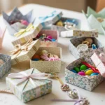
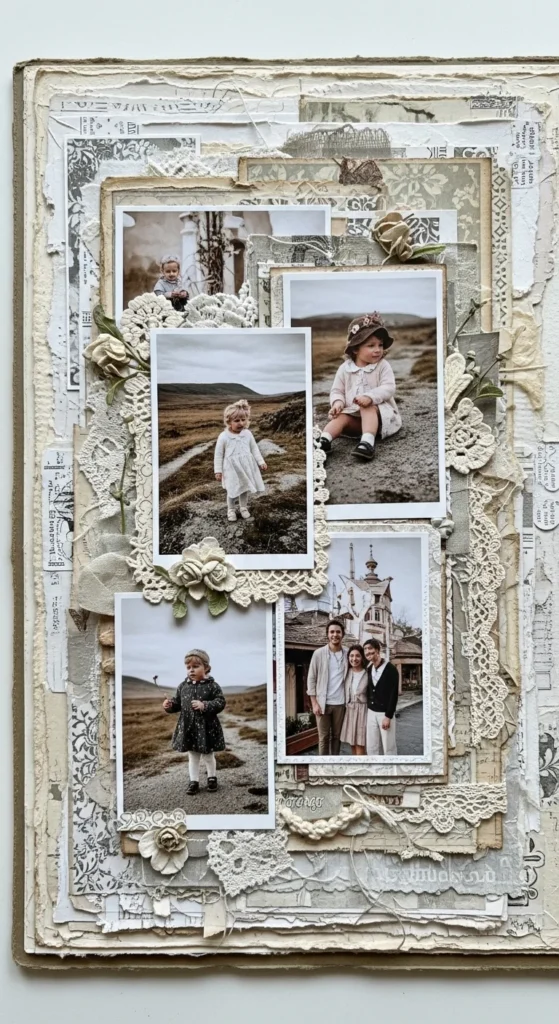
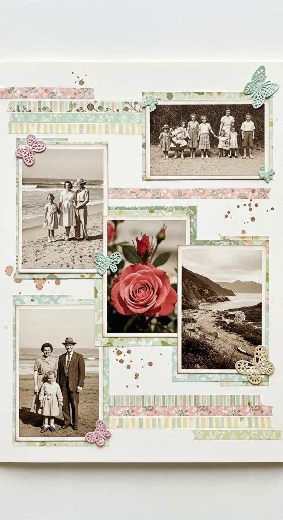
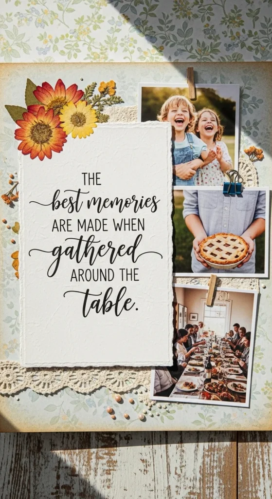
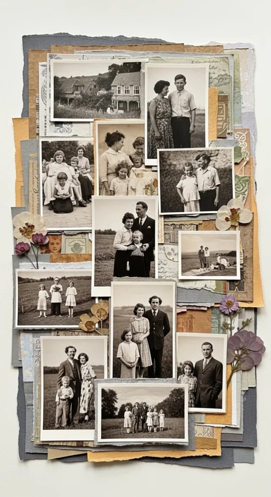
3. Vintage Ephemera Layers
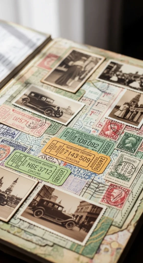
Vintage ephemera layers add story and depth. Gather old-style paper scraps, postcards, ticket stubs, and lace bits. Arrange them in overlapping layers before placing your main photo on top. Slight uneven edges give character. Stick to muted tones like faded pink, brown, and soft blue for harmony. This style feels artistic without needing perfect alignment. It’s ideal for heritage photos, travel memories, or sentimental pages.
4. Negative Space Highlight
Negative space gives the eye a place to rest. Place your photos and decorations in one area of the page. Leave the rest clean and open. This makes the layout look modern and intentional. A few small accents like dots or a thin line can balance the empty space.
5. Bold Floral Background
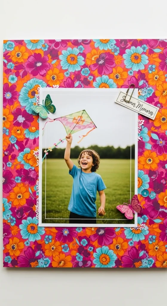
A bold floral background creates instant visual impact while keeping the layout simple. Choose one large-scale floral paper with strong colors and let it cover most of the page. Because the pattern already carries so much detail, keep everything else minimal. Mount your photo on a plain piece of cardstock in a neutral shade like white, cream, or soft grey. This helps the photo stand out against the busy background. Place the photo slightly off-center for a relaxed feel. Add just one or two small embellishments, such as a label or a tiny sticker, near the photo. Avoid layering too many papers on top of the floral print. The goal is to let the background shine without overwhelming the eye. This style works especially well for celebration photos, birthdays, or summer memories. It looks dramatic but is actually very easy to assemble.
6. Ditsy Floral Overlay
Ditsy floral prints add a gentle, romantic touch to scrapbook pages. These tiny scattered flowers work best as soft overlays rather than bold backgrounds. Start with a plain cardstock base in a light color. Add a strip or panel of ditsy floral paper along one side or corner of the page. This keeps the pattern subtle and balanced. Place your photos on top of solid mats so they don’t get lost among the tiny prints. Keep embellishments simple, such as small dots or thin borders. The small-scale pattern creates texture without taking over the design. This layout feels light and calm, making it perfect for everyday memories, spring photos, or friendship pages. Beginners find this approach easy because the pattern does the decorating work without needing many extra elements.
7. Texture Stacked Background
A texture stacked background adds depth and interest using simple materials. Start with a neutral base like kraft paper or light beige cardstock. Layer different textures on top, such as linen scraps, tissue paper, or lightly wrinkled patterned paper. Slightly tear the edges of some layers to create a soft, lived-in look. Keep the colors within the same family so the layers feel connected. Place your photos on top of this stack using a clean white or solid mat to separate them from the busy background. Add just a small embellishment or label near the photo. This approach makes the page feel rich and dimensional without needing many decorations. It’s also a great way to use leftover paper scraps and fabric bits.
8. Pre-Coordinated Kit Layout
Using a pre-coordinated kit makes aesthetic scrapbooking much easier. These collections include papers and embellishments that already match in color and style. Start by choosing two patterned papers from the set for your base and photo mat. Add a few stickers or die cuts from the same kit to decorate around your photos. Because everything was designed to work together, you don’t have to worry about clashing colors or patterns. Keep the layout simple by grouping decorations in one area. This method is ideal for beginners or when you want a beautiful page quickly. It also helps you stay within a consistent theme across multiple pages. The finished layout looks cohesive and polished with very little effort.
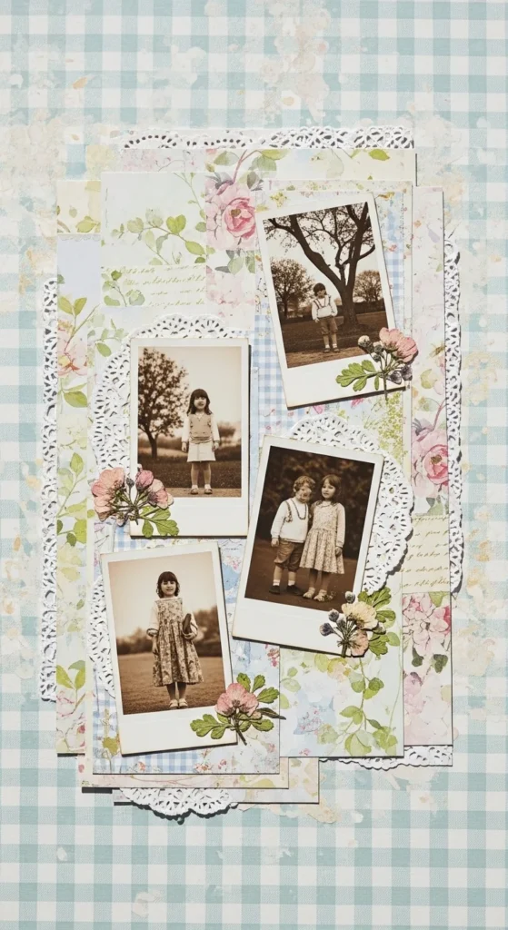
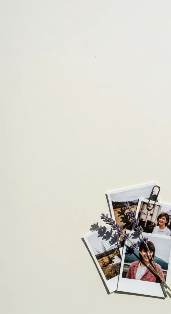
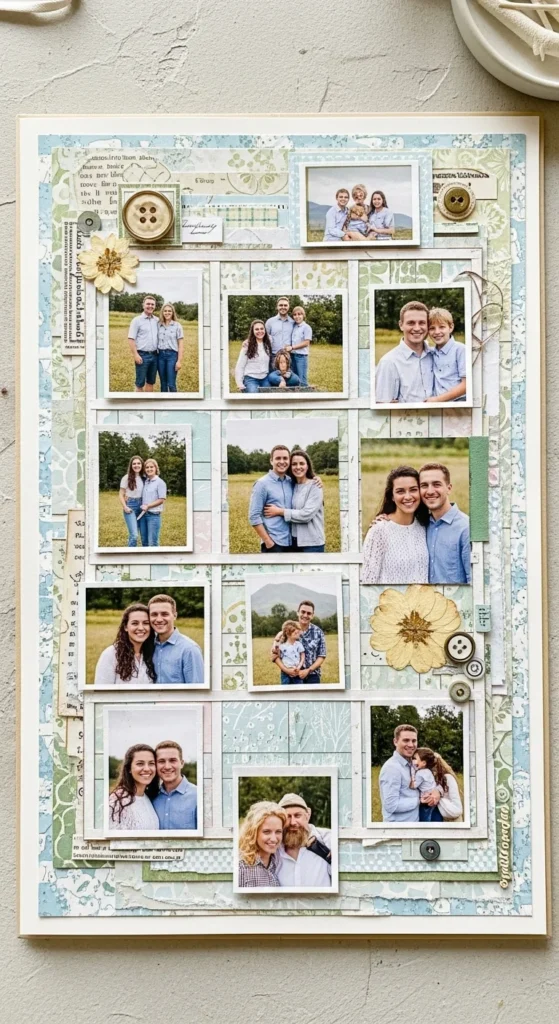
9. Polaroid Style Photo Cluster
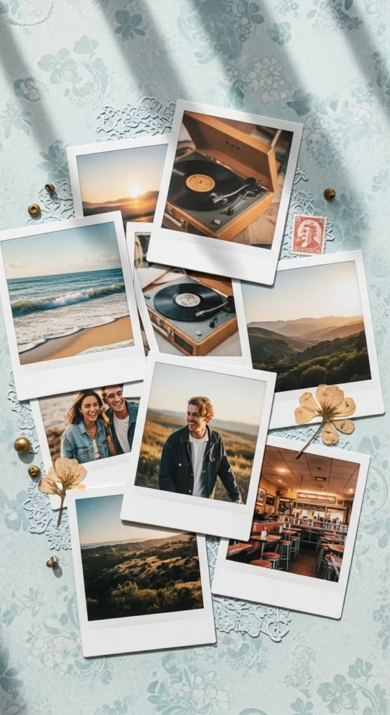
Polaroid-style clusters bring a casual and nostalgic vibe to scrapbook pages. Mount each photo on a small white cardstock piece, leaving extra space at the bottom to mimic instant photo frames. Arrange the “Polaroids” in a loose cluster, slightly overlapping and angled. This relaxed placement makes the page feel natural and friendly. Use a soft background paper so the white frames stand out. Add a few tiny embellishments like dots or small hearts around the cluster. You can also write short notes on the white space below each photo. This style works well for friend gatherings, trips, or everyday snapshots. It looks detailed but comes together using simple cutting and layering.
10. Gold Foil Accent Page
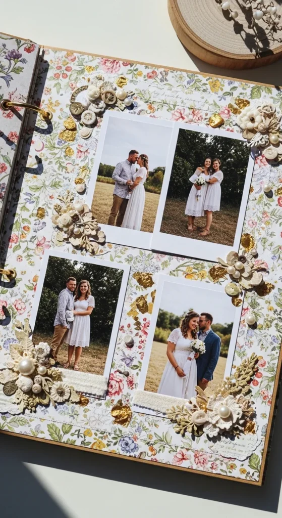
Gold foil accents add a touch of shine without overwhelming the page. Use papers or stickers that have small areas of metallic detail. Place your photos on neutral mats so the foil stands out gently. Add a few gold elements, such as thin borders, tiny stars, or small labels. Keep the rest of the decorations minimal so the shimmer remains subtle. This works beautifully for milestone moments, weddings, or celebrations. The metallic highlights catch the light and make the page feel special. Beginners can achieve this look easily by using pre-made foil stickers or paper packs. A little shine goes a long way in making a scrapbook page feel elegant.
11. Washi Tape Framing
Washi tape framing is an easy way to add detail without adding bulk. Choose two or three tape patterns that match your color palette. Place strips along the edges of your photos to create simple frames. You can also run tape along the page border for a finished look. Slightly tear the ends for a soft handmade feel. This method adds color and pattern without complicated cutting. It’s perfect for beginners who want quick decoration. Washi tape is affordable and easy to reposition if you make a mistake. Keep other embellishments minimal so the tape remains the highlight.
12. Handwritten Quote Focus
A handwritten quote adds personality and emotion to a scrapbook page. Write a meaningful phrase on a small piece of cardstock using a pen or marker. Place this card near your photo cluster so it becomes part of the design. Keep the handwriting simple and clear. Use a neutral or soft background so the quote stands out. Add only a few small embellishments around the card, such as tiny dots or a thin border. This layout works well for friendship memories, love notes, or reflective moments. Beginners like this idea because it adds impact without needing many decorative supplies.
13. Asymmetric Balance Layout
An asymmetric balance layout places elements off-center while still feeling stable. Position your main photo toward one side of the page. On the opposite side, add a small cluster of embellishments or paper pieces. This visual balance keeps the page interesting and modern. Use similar colors on both sides so the design feels connected. Leave some open space around the elements so the layout can breathe. This style looks thoughtfully designed but is easy to create. Beginners often find this approach more natural than strict symmetry. It gives movement and personality to the page without extra effort.
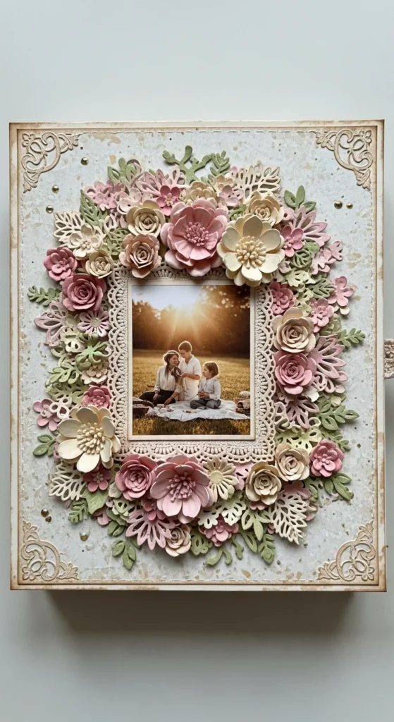
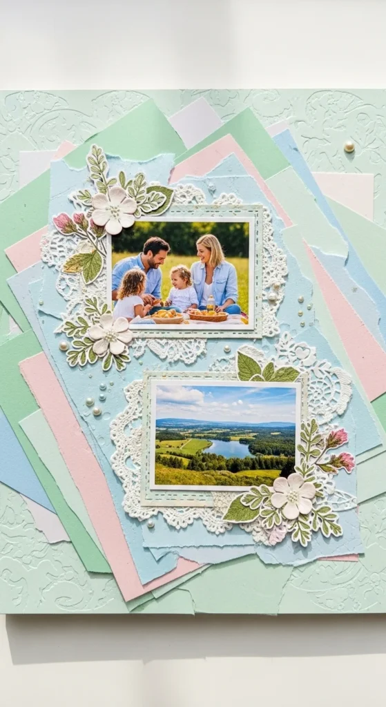
14. Pressed Flower Embed
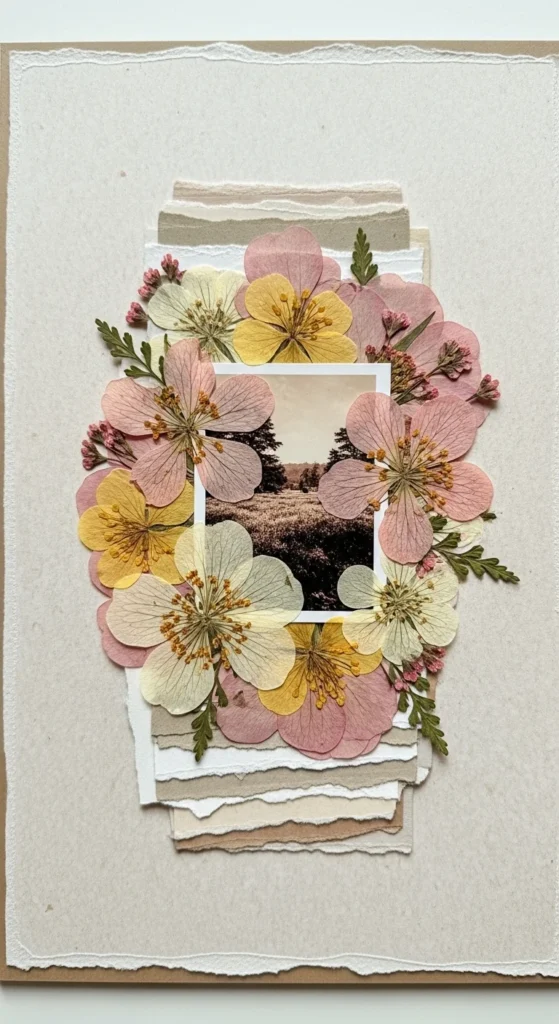
Pressed flowers bring real texture and gentle beauty to scrapbook pages. Dry small flowers or leaves between book pages for several days. Once flat, glue them lightly around your photo using clear adhesive. Keep the arrangement airy rather than crowded. Pair them with plain or lightly textured paper so the natural shapes stand out. This style feels soft and personal, especially for outdoor memories, garden days, or spring events. Beginners like this idea because nature does most of the decorating work. Add a thin paper mat behind the photo to separate it from the organic shapes. The result feels calm, tactile, and visually pleasing without many extra supplies.
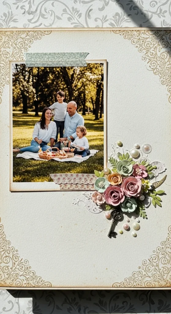
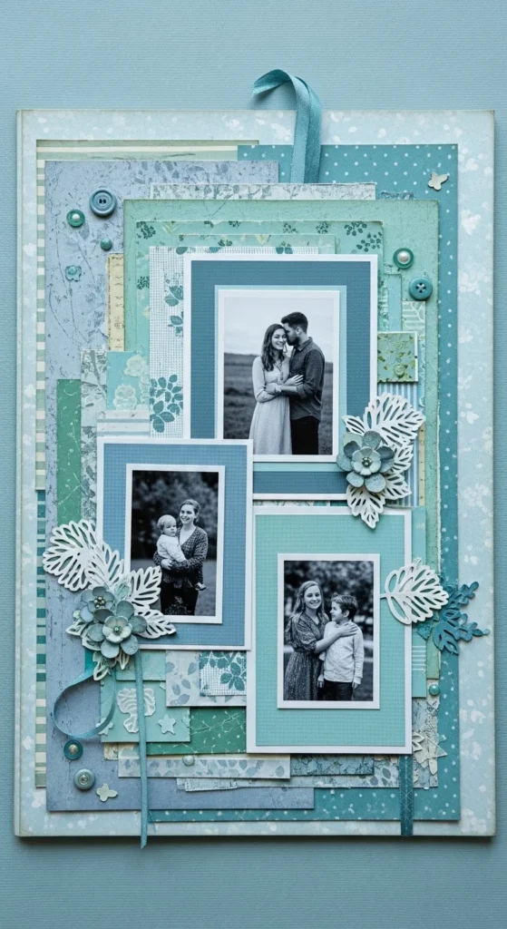
15. Layered Frame Stack
A layered frame stack adds depth using simple paper pieces. Cut several rectangles from different patterned or solid papers. Each layer should be slightly larger than the one above it. Stack them behind your photo so the edges peek out evenly. Stick to two or three colors for a cohesive look. Slightly offset one layer for a relaxed touch. This technique fills space while keeping the focus on the image. It’s a great way to use leftover paper scraps. Beginners enjoy this method because it looks detailed without complicated tools or measuring.
16. Minimal Notes App Style
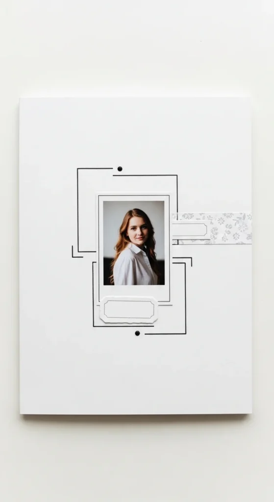
A minimal notes-style layout feels modern and uncluttered. Use a plain white or very light background. Add a small photo and a few thin line accents drawn with a pen or marker. Include a tiny label or short caption beneath the photo. Keep all elements aligned in a neat row or column. Leave plenty of open space around everything. This style feels calm and thoughtful. It’s perfect for everyday moments, journaling, or quiet memories. Beginners like this approach because fewer elements make layout decisions easier. The page looks clean and intentional with very little decoration.
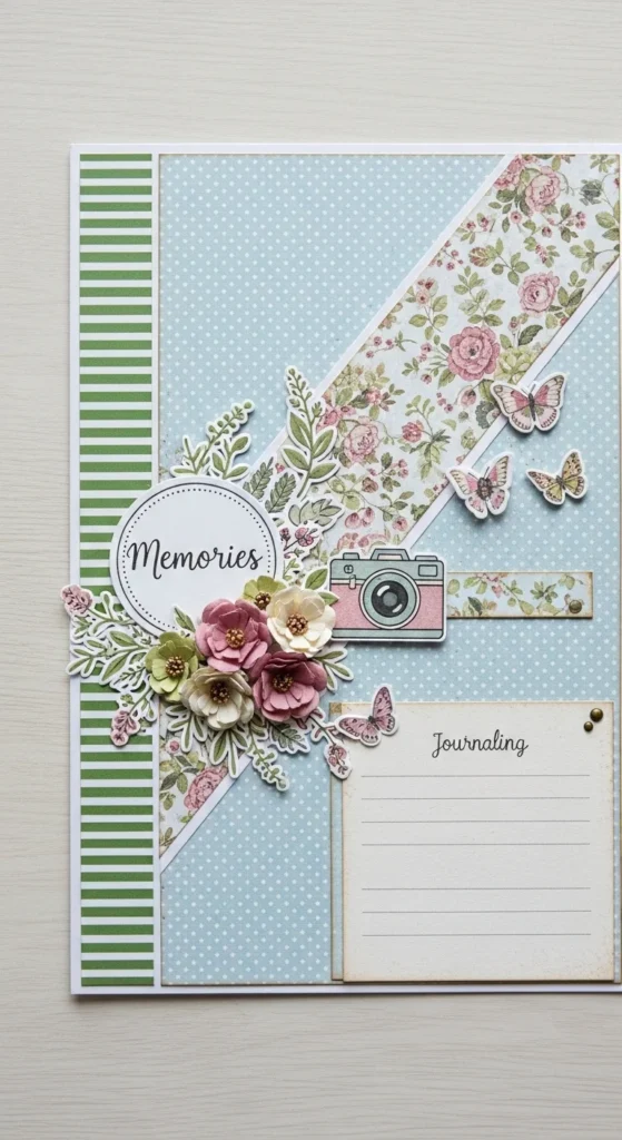
17. Insect and Floral Motif Page
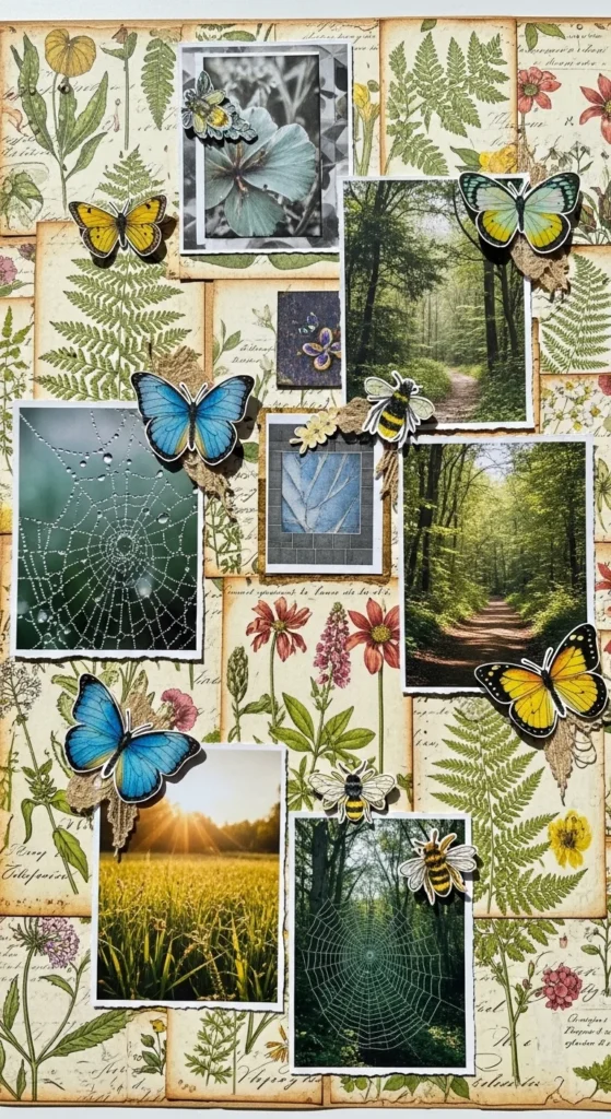
Adding small insect motifs alongside florals creates gentle movement and charm. Start with botanical patterned paper as your base. Place your photos on simple mats so they stand out. Add tiny butterfly or bee stickers near the flowers to create a nature theme. Keep the embellishments small and spaced apart. This prevents the page from feeling crowded. The combination feels whimsical yet elegant. It works well for spring, garden, or outdoor adventure memories. Beginners can use pre-made stickers to keep things simple. The natural theme helps guide decoration choices without overthinking.
18. Color Palette Matched Photos
Matching your paper colors to tones in your photos creates visual harmony. Look closely at the dominant shades in your pictures. Choose background papers and embellishments in similar hues. This helps everything feel connected without needing many decorations. Use one or two accent colors for small details. Keep the rest of the page neutral so the photos remain the focus. This approach makes pages look polished and thoughtfully designed. Beginners find it helpful because the photos guide color choices. It’s an easy way to achieve a cohesive aesthetic.
19. Cover Decoupage Style
A decoupage-style cover creates a beautiful first impression. Cut out shapes from floral or patterned papers. Layer them around the edges of the cover like a collage. Place one main photo in the center as the focal point. Keep colors coordinated so the cover feels unified. Use glue sparingly to avoid wrinkles. This layered look feels artistic and welcoming. It sets the tone for the scrapbook inside. Beginners enjoy this because cut-out shapes are easy to arrange and adjust. The cover becomes a preview of the memories that follow.
20. Soft Fabric Texture Page
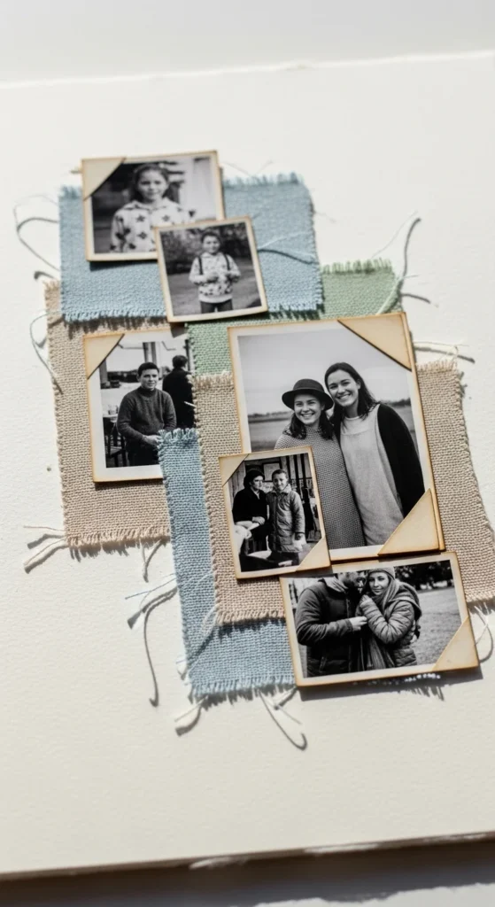
Small fabric pieces add softness and depth to scrapbook pages. Cut thin strips from old fabric scraps like cotton or linen. Layer them behind your photos as textured mats. Keep colors subtle so they don’t overpower the design. Fabric adds dimension without heavy embellishments. Pair it with simple paper backgrounds to keep the page balanced. This idea works well for cozy home memories, baby pages, or handmade themes. Beginners like it because fabric pieces don’t need perfect edges. The texture adds interest naturally.
21. Monochrome Mood Page
A monochrome mood page uses different shades of a single color. Choose a base color like blue, green, or beige. Use lighter and darker tones of that color in your papers and embellishments. This creates depth while keeping the page calm. Add photos that include similar tones for harmony. Keep decorations minimal so the color story remains clear. Beginners find this style simple because there are fewer color decisions. The finished page looks polished and balanced.
22. Layered Transparency Effect
Vellum overlays add softness and a dreamy feel. Place a piece of vellum over part of your page. Tuck small photos or decorations underneath so they show through gently. Secure the vellum at the edges with tape or brads. Keep the background simple so the transparent layer stands out. This technique adds depth without heavy layering. It works well for romantic, calm, or reflective themes. Beginners can try this with tracing paper if vellum isn’t available.
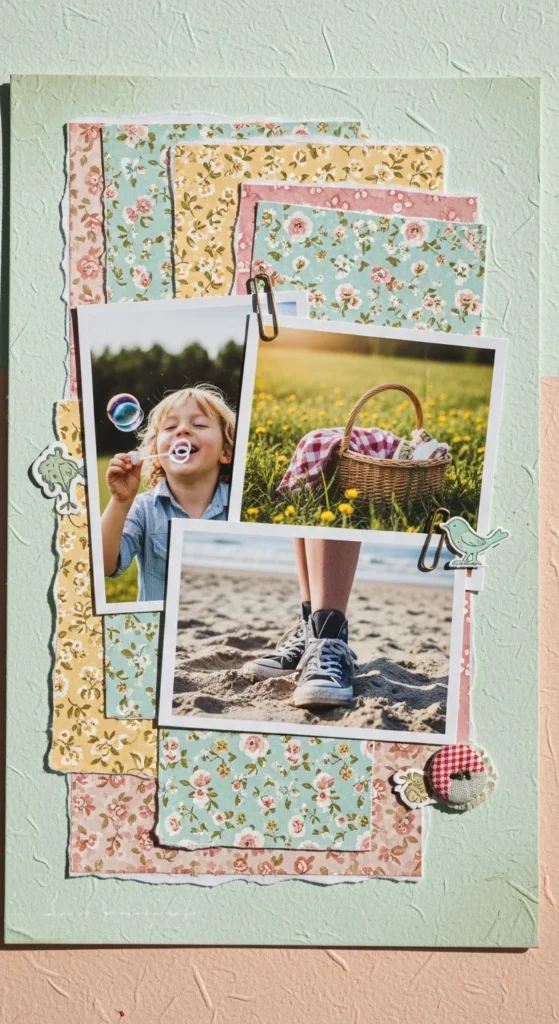
23. Ticket and Tag Cluster
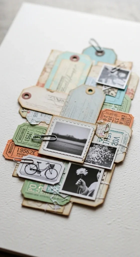
Cluster small tags and tickets to create a storytelling corner. Arrange them in overlapping layers near your photos. Keep the cluster on one side of the page to maintain balance. Use a neutral background so the pieces remain visible. Add a short handwritten note on one tag. This layout captures memories in a personal way. It’s ideal for travel, events, or everyday moments. Beginners find this style forgiving because uneven edges add character.
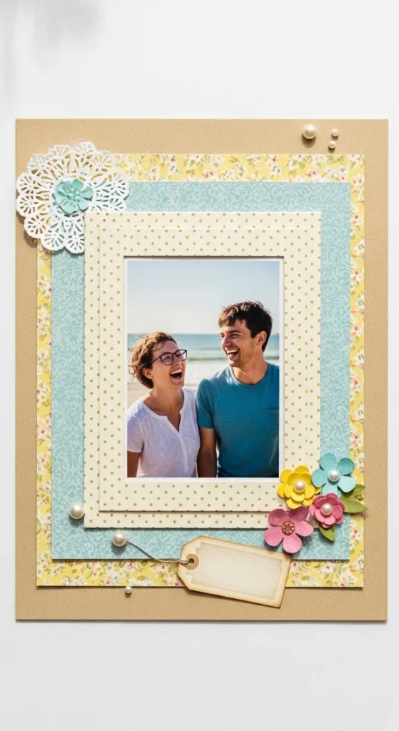
24. Simple Border Frame Page
A simple border frame gives the page a finished look. Cut thin strips of patterned paper and glue them along the page edges. Keep the border narrow so it doesn’t distract from the center. Place photos and decorations inside this frame. This structure helps guide layout placement. Beginners like it because the border defines the design area. It adds polish with very little effort.
25. Light Pastel Dream Page
Pastel palettes create a gentle and soothing aesthetic. Use papers in soft pinks, blues, yellows, or lavender. Layer photos on white or light mats for contrast. Add tiny embellishments like dots or mini flowers. Keep everything light and airy. This style works beautifully for friendship, baby, or spring memories. Beginners enjoy this palette because the colors naturally blend well together.
26. Digital Template to Paper Page
Using a digital layout as a guide can simplify page planning. Sketch or print a grid design from a digital template. Follow the layout when arranging photos and papers on your physical page. This helps with spacing and alignment. Keep embellishments minimal to match the clean structure. This hybrid approach combines digital planning with hands-on crafting. Beginners benefit from having a visual guide to follow. The result looks balanced and thoughtfully arranged.
27. Clean Grid with Gold Dots
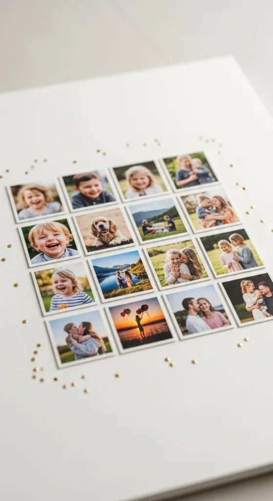
A clean photo grid paired with small gold dots creates a modern aesthetic. Trim photos into equal sizes and arrange them in straight rows. Leave small gaps between each photo. Add tiny gold dot stickers in a few open spaces for subtle sparkle. Keep the background neutral so the grid stands out. This design feels tidy and stylish. Beginners appreciate the structure of a grid layout. The small metallic details add charm without overwhelming the page.
Conclusion
Aesthetic scrapbook pages come from balanced layouts, gentle color choices, and thoughtful layering rather than heavy decoration. Soft textures, natural elements, and simple patterns help each page feel calm and beautiful. Focusing on one design idea at a time keeps the process enjoyable and manageable. With a few papers, photos, and small embellishments, you can build pages that feel cohesive and meaningful. Over time, these consistent choices create a scrapbook that looks polished while still feeling personal and heartfelt.

Lily Summers is a digital artist and creative storyteller who loves bringing colorful characters to life. With a passion for cartoons, fan art, and playful sketches, she inspires others to explore their imagination through art. When she’s not sketching, you’ll find her dreaming up new ideas for CraftedWizard.com to spark creativity in every artist. 🌈✨